Wildfires have raged across California and the Pacific Northwest, burning millions of acres. Let’s take a look at ways to visualize the impact of these fires.
100 Years of Burning
Watch how data visualization was used to portray the change of the severity and frequency of fires in this animated map of California Wildfires from 1910-2019 from Esri.
The “New” Normal”

Reporting for BuzzFeed News, Berkeley AMI instructor Peter Aldhous, brings us two wildfire visualizations for California. It highlights the frequency and severity of fires over 12 months for the past 10 years, along with the millions of acres burned over the last 20 years.
Visualizing Damage
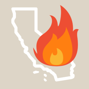
USA Today gives a simple but compelling visual guide to view the amount of damage in acres the fires have caused. While viewing this guide, think about how data visualization used to create a long-lasting impact their audience.
Reducing Impact
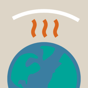
Explore the effectiveness of data visualization by viewing Information is Beautiful’s comprehensive graphic on How We Get to Zero Greenhouse Gas Emissions across different industries and interests.
Want to learn how to effectively use data for storytelling purposes? Sign up for our new Online Data Visualization course starting on November 16th.
Find these articles helpful? Sign up for our newsletter for updates on our courses and up-to-date resources. Follow our social media accounts and let us know how we can assist you along your professional journey.