Tutorial: QGIS basics for Journalists
Introduction
QGIS is a free, open source GIS application for Windows and Mac that provides a great starting point for journalists who want to learn to explore data with maps.
Understanding how to visualize map data is an important skill but it can be intimidating. This QGIS tutorial will guide you through the basics, covering how GIS files work, how to edit them and how to join them with external data for analysis. It will also give you the tools to make simple, interactive data maps that work on every platform.
This QGIS tutorial was created using version 1.6. QGIS Version 1.7 introduced a couple of significant changes. I’ll try to address them as we go.
Installation
Installing QGIS on a Mac can be a little complicated since it requires a few support programs to operate efficiently. Simply downloading the QGIS package that matches your operating system will allow you to complete the tutorial but QGIS will not function as well.
Mac users
Go to the Mac download page and download the GDAL and GSL frameworks and install them. You must have an admin password.
We’re going to skip the GRASS install. GRASS is another open source GIS application that can give QGIS better data management. It’s very powerful but more than we need at this point.
Download the QGIS package that matches your system and install it.
Windows users
The Windows install is super easy. Everything you need to get started is in one exe file. Go to the Windows download page and download the QGIS installer. The wizard will install everything you need, including all the frameworks and GRASS application. The install may take a while so be patient.
The interface
QGIS is very simple to navigate. It’s made up of a layout area where the map is drawn surrounded by a toolbar, layers panel and a status bar.

Toolbars can be controlled in turned off or on in the Toolbars menu. You can arrange them by clicking and dragging.

It’s a good idea to set up your plugins the first time you launch. QGIS comes with several plugins and you find find some really useful third-party plugins to help your workflow. Go to Plugins -> Manage plugins to turn them off or on. I recommend enabling the following:

Projections: Making maps accurate
Maps have played a critical role in history for thousands of years. They have been used to start wars, make fortunes and topple governments.
One of the great advances during the Age of Discovery was the refinement of latitude and longitude. Amerigo Vespucci (the cartographer who named the Americas after himself) used the moon and Mars to calculate the most precise measurements of latitude of his time. Even though the maps were fairly inaccurate, they helped the Spanish navigate oceans, circumnavigate the globe and amass tremendous wealth. At the time, maps were considered state secrets.
Governments are still trying to improve the accuracy of maps. Satellites, sonar and even the space shuttle have been used to improve our understanding of geography.
But fortunately, many maps are not considered state secrets and governments are a primary source of map files (e.g. U.S. Census Bureau). The challenge of making public maps is creating a standard that everyone can use. That’s where geographic information systems (GIS) come in.
The basics
GIS generates accurate maps by converting a 3D globe to a 2D plane. Latitude and longitude create a coordinate system, which gives us the ability to “unwrap” the the earth’s surface.
But creating a square map out of a globe requires us to distort the geography. The closer one gets to the poles, the more the surface is distorted. That’s why Antarctica looks 7 times larger than the contiguous United States in the example below. In reality, Antarctica is only about 60 percent larger.

The example above is one of two types of coordinate systems. Specifically, it’s referred to as a geographic coordinate system or geographic projection. There are many versions of geographic coordinate systems but the most common are NAD 83 (used by the U.S. government) and WGS84 (used by GPS devices and Google maps).
But the distortion inherent in geographic coordinate systems creates maps that misrepresent the shape and size of geographical areas. To adjust for that, cartographers create projected coordinate systems.
Projected coordinate systems often take a portion of the globe and unwrap it in a way that will more accurately represent either the shape of a boundary or the area of a boundary. One of the most popular projections in used North America maps is Albers Equal Area Conic Projection. Here’s how it compares to a geographic projection:
The Albers projection is a more accurate representation of the size of the United States.
Setting your projections
So here’s the tricky part. Projections distort maps to create a desired result. Most files you get from sources will have a projection assigned to them and they may have to be converted to match your project. There are hundreds if not thousands of projections and some won’t easily convert to others.
I set all my projects to NAD 83 or WGS84 as a default. That’s also QGIS’s default coordinate system and it seems to convert easily. But you need to know how to change your projection before you publish your project.
Click the Edit Projection button in the bottom-right corner of the status bar.

This opens the Project Properties. Check the Enable ‘on the fly’ projections box, then you can choose a projection from the library, search for one or access one you have used in the past.

To set your projection, click the Apply button. Then click on the Layers tab to make sure the projection is applied to all your map layers.

Understand, load, export map files
There are several formats that QGIS and other GIS apps will open and export. The most common is the SHP or “shape” format. While other filetypes are important, we will work with SHP files in this tutorial.
How SHP files work
SHP files are made of editable “vectors.” All that really means is that it calculates the distance between points on a map and draws lines.
There are three types of SHP files:
Point files include one or more specific locations. This is essentially what you see on a Google map.
Line files connect groups of points. These can be used to draw roads, rivers, etc.
Polygon files connect points into closed shapes. The shapes usually form boundaries such as ZIP Codes or tracts.
And if they all use the same projection, they can be accurately layered together.

And finally, SHP files are really a collection of files:

SHP contains the drawing information.
DBF contains the data about each shape, such as name, address, etc.
SHX is an index file that ties the two together.
PRJ contains the projection information.
Some agencies will also include metadata which describes properties of the files.
Import a shape file
So lets get started. Download the project files and unzip them. We’re going to be working with 2010 census tract files of Alameda County, Calif.
Go to the Layer menu and select Add vector layer (Command-shift-V). Navigate to the project files and open SHP files – source folder, then the alameda-2010-tracts folder and then click on the file that ends in .shp and click Open. A map will appear in the layout area and a layer is added to the panel.

Edit the layer properties
Go to the Layer menu and select Properties. A new window will appear. Symbology should be selected by default. Click the Properties button:

In the new window, change the Fill color and the Border color and click OK. This will take you back to the properties window. Click the Apply button on the bottom left corner to see the changes or click OK.
Changes in Version 1.7: There were some substantial changes to Layers properties. The vertical menu is now a set of horizontal tabs. The image below notes the important changes.

Search data to select boundaries
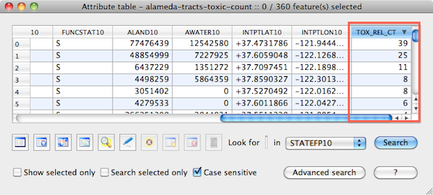
One of the quickest ways to select shapes in a layer is with search. Go to the Layer menu and select Open Attributes Table. This opens the information in the DBF file. The initial columns usually identify each record. In this case, we see six columns of Federal Information Processing Standards (FIPS) IDs.

NOTE: FIPS abbreviates names of places to make files smaller and make it easier to join data with SHP files. In this case, 06 is the state of California, 001 is Alameda County, 437800 is the name of a tract and 06001437800 is the complete Geographic ID.
The row of buttons let you edit the data and the Search field lets you find specific records. QGIS can search inside individual cells and select ranges based on the content of cells.
Scroll the window to the right until you see the column NAMELSAD10. In the search field, type 4378. Then change the pull-down menu to NAMELSAD10. Click Search and the field will highlight and tract 4378 is selected in your map. It’s small and you may have to look closely.
Advanced search
Click the Advance Search button. In the Fields area, click on AWATER10. Look in the Values area and click the All button. This gives you all the values in the AWATER10 field — the square meters of surface water in each tract.
The Operators buttons help you build search queries. Once you are comfortable with the syntax, you can type them directly into the text field. If there is anything in the text field now, select and delete it.
Double-click AWATER10 to add it to the text field. Click the Greater Than ( > ) button and then type 1000000. This will search for tracts with more than 1 million square meters of surface water. Click the test button and it tells you how many tracts will be selected. If you get an error, make sure the query matches the image below.

Click OK and return to the Layer Properties window. Click OK again to close it. You should see several tracts selected.
Save selection as a new SHP file
This is a handy tool when you need to extract a few boundaries from a large map file. You can search for and select the boundaries you need, go to the Layer menu and select Save Selections as Vector File.
Create a new folder to keep all the files organized and Voila! — a new shape file.
Save your work.
Edit vector maps
It’s fairly easy to edit individual boundaries in QGIS, but I recommend journalists avoid it until they are more advanced. But there are some cases where you will need to bulk edit to your polygons. QGIS includes several tools that make that simple. We’re going to explore the Difference command.
Consider our Alameda map. You may have noticed that the western edge doesn’t conform to the shape of the San Francisco Bay. That’s because political boundaries extend offshore and Census maps reflect political boundaries. If you were to superimpose this on a Google or GeoCommons map, it would look very odd.
In QGIS, we use a water SHP file to “clip” the boundaries to the shoreline.
Add a water layer
Go to the Layer menu and select Add vector layer (Command-shift-V). Navigate to the project files and open SHP files – source folder, then the alameda-2010-water folder and then click on the file that ends in .shp. Click Open.
A map of ocean, lakes and rivers will appear in the layout area and is added to the layer panel. While this is a perfectly fine way to render a map, we will use the water boundaries to edit the tract map.
Select the SF Bay shapes
We need to figure out how to quickly select just the SF Bay water boundaries because we don’t want to cut the lakes out of the land layer. To do this, go to the View menu and select Identify Features. Click on one of the SF Bay boundaries and a window ill appear with its attributes:

The FULLNAME field identifies the boundary as part of the San Francisco Bay.
The MTFCC field identifies the boundary as H2051.
You might be tempted to use the FULLNAME field but don’t. It may not include important estuaries that define the coastline. Best practice is to use MTFCC which is short for MAF/TIGER Feature Class Code (Yes, it’s an acronym of an acronym — get used to it). MTFCCs group similar features. H2051 identifies Bays, Estuaries, Gulfs and Sounds.
NOTE: Lists of MTFCC codes have been included in the Resources folder in the tutorial files.
Go to the Layer menu and select Open Attributes Table.
Click the Advance Search button. In the Fields area, click on MTFCC. Look in the Values area and click the All button.
Double-click MTCFF to add it to the text field. Click the Equals button, then double-click H2051 in the Values box.
Or you can simply type MTFCC = 'H2051' in the text field. Click OK and close the Attributes Table window. All the boundaries that affect the coastline should now be selected.
Clip the tract layer
Go to the Vector menu and select Geoprocessing Tools and select Difference. Make sure the window is set up like the example below.

To get an Output shapefile, click the Browse button and navigate to the tutorial files. Create a new folder (button is on the top right), open it and give the file a name. When you’re done, click Save to return to the Difference window.

Click OK and the operation will process. QGIS will ask if you want to add the new file to your project. Click Yes then click the Close button on the Difference window. You should end up with something that looks like this:

This one of the many powerful tools available in QGIS and they are explained in the manual (included in the resources folder). Take some time and experiment.
Save your work.
Join data to a map
Whew. Still with me? Good — we’re getting to the important stuff.
One of the main reasons journalists are interested in data mapping is to analyze data for a story. To do that, we need to join a spreadsheet to a map layer’s database file. That happens inside QGIS.
QGIS is supposed to be able to join a CSV file or another DBF file. I occasionally have problems working with CSVs and have developed the habit of opening them in OpenOffice and saving as a DBF. OpenOffice is free, open source and works on Mac, Windows and Linux. I’ve yet to have a DBF fail when I prepared it properly.
Formatting the data
This exercise will add census housing information to the clipped shape file you just made. Here’s a look at the data.

Notice that the first column is GEO_ID and it matches the GEOID10 column in our map file. Joins match two columns in different databases.The join will fail if there are any irregularities. It happens a lot so patience is required. But using standards like FIPS reduces errors considerably.
Import
Go to the Vector menu and select Data Management Tools and select Join attributes. When you select the DBF option, QGIS will ask you to locate the file. Navigate to the data folder and select data-join.dbf. Set up the Output shapefile the same way it was described in the Edit Vector Maps section. The window should be set up like the example below.

Once you’ve clicked OK and processed the Join, close the window and open the clipped layer’s Attribute table. Scroll to the right until you see the new data:

Save your work.
Changes in Version 1.7: There were substantial changes to joining data. Go to the Layer menu and select Add Vector Layer. Navigate to the data files and open data-join.dbf (Confession: I’m not sure why this works but it does). This will add the file to your layers menu. Next, open the Layer Properties and select the Joins tab. Click the plus (+) sign and match the data the way we did above.
Set a color range based on data
An effective way of analyzing data it to graduate the colors on a map based on a field’s data. The technical name for this type of map is choropleth but it’s often referred to as a heat map or data map. This kind of coloring is applied to individual layers in the Layer Properties panel.
Change the layer properties
Make sure the layer with the joined data is selected in the Layers panel, go to the Layer menu and select Properties. A new window will appear. Symbology should be selected by default.
Change the Render pulldown menu to Graduated.
- Graduated spreads the color from dark to light or light to dark.
Change the Column to TOTAL_HOUS.
- This is the data we’re going to use but you could select any of the columns.
Change the Classes to 5.
- This sets the number of steps in the data. Five is a good starting point.
- Try fewer steps when possible. It makes the map easier to read.
- Seven classes should be your max. More steps may highlight important data but can make the rest of the map hard to read.
Change the Color ramp to blue.
- Color ramps are very important and we’ll talk more about them below.
Set the Mode to Equal Interval.
- This describes how the data is broken down to create classes
- Modes also get their own section below.
Click the Classify button.
- This should create five symbols with ranges and labels
- You can double-click to edit them
Your Layer Properties should look something like this:

Click the Apply button. The map colors change and the classes are added to your layer.

Modes
QGIS includes five modes for breaking data into classes. The first four are good for statistical exploration, the fifth is better for readers. They are:
Equal Interval: Divides your data into equally spaced groups. For example, data with a top value of 10 could be divided into five classes of 0 to 2, 2.1 to 4, 4.1 to 6, 6.1 to 8 and 8.1 to 10.
Quantile: Uses an equation to divide values into equal-sized subsets. For example, if you have 15 records and five classes, each class will have 3 records.
Natural Breaks (Jenks): Designed to create a map that is an absolutely accurate representation of data’s spatial attributes. It arranges records into different classes based on their values. It tries minimize the differences within classes while simultaneously maximizing the difference between classes.
Standard Deviation: Illustrates how values deviate from the average. Low deviation indicates values are close to the average. High deviation indicates they are far away from the average.
Pretty Breaks: Breaks the values into classes that are easily understood by non-statisticians. Example classes could look like this: 14 to 100, 100 to 200, 200 to 300, 300 to 378.
Use all of them. They will help you explore your data and find trends and outliers. And don’t be afraid to edit the classes directly. This can also lead to interesting and informative results.
Changes in Version 1.7: The Equal Interval mode does not work in QGIS 1.7 due to a bug. Some people have reported a workaround by right-clicking on the joined layer and selecting Save As. Saving the shp file with a specified coordinate system should fuse the data permanently and allow Equal Interval to work. However, this has failed on some occasions.
Color ramps
Poor color choices make many, many maps completely unreadable. Since we don’t have time for a lesson in color theory, I’m going to show you a short cut.
Cynthia Brewer, a professor of geography at Penn State, developed a tool called ColorBrewer that creates map colors that are easy to read. I strongly recommend that you spend some time on the site to learn how it works. Make sure to click on the “Learn More…” links. She does a good job of explaining map colors. Here’s an abbreviated look at the three types graduate colors used in maps.
 Sequential: Use with data that goes from low to high. Low numbers should be lighter and high numbers should be darker.
 Diverging: Use to emphasize the change from a critical mid-range value and extremes at both ends of the data range. The critical class is a light color and low and high extremes are dark colors with contrasting hues.
 Qualitative: Use to show differences between different categories of data. Do not use this for sequential data because they do not imply differences between legend classes. This is the hardest type for normal readers to understand so use sparingly.
QGIS has integrated ColorBewer into the Color ramp menu. Here’s how to use it.
Click on the Color ramp menus and select New color ramp… from the menu.
In the Color Ramp Type pop-up box select ColorBrewer from the pulldown menu and click OK
This opens the ColorBrewer Ramp menu. The Scheme name has 35 presets to choose from. Select Oranges.
Change the Colors menu to match the number of classes you have and click OK.
QGIS will ask you to give the new ramp a name. I use is pretty simple naming convention for my color ramps and would name this “Oranges – 5.” If I was using four colors it would be named “Oranges – 4”
Click Apply and the new colors will be reflected in the map. Once you have color ramps that are easy to use, stick with them. It makes it easier for you to spot interesting trends in your data.

Save your work.
Add roads
It’s important for people to have landmarks when reading a map to help them locate areas of interest. Major roads are one of the primary land marks that everyone understands and most maps are incomplete without them.
Roads are line SHP files. The Census includes all roads in a single SHP file. So you’ll want to create versions where you isolate just the roads you want so you can access them quickly in the future. They are edited the same way as the boundary layers.
Load the roads SHP file
Go to the Layer menu and select Add vector layer (Command-shift-V). Navigate to the project files and open SHP files – source folder, then the alameda-2010-roads folder and then click on the file that ends in .shp. Click Open. A roads layer will be added to the map.
Make sure the roads layer is selected, go to the Layer menu and select Open Attributes Table. Search for S1100 in the MTFCC column. S1100 is the code for major roads. Click OK
NOTE: Lists of MTFCC codes have been included in the Resources folder in the tutorial files.
Create a major roads SHP file
Go to the Layer menu and select Save Selection as vector file. Save the file in a new folder and call it alameda-major-roads.shp.
Load the major roads SHP file and hide the original by unchecking the box in the Layers panel.
Open the major roads layer properties and change the line width to 1 and change the color to white. Click OK. Your map should look like this:

Create a secondary roads SHP file
Let’s do the same with secondary roads in case we have to do a more detailed map later.
Hide the major roads layer and show the original roads layer.
Make sure the original roads layer is visible and selected. Go to the Layer menu and select Open Attributes Table. Search for S1200 in the MTFCC column. S1200 is the code for secondary roads.
Close the attributes window, go to the Layer menu and select Save Selection as vector file. Save the file in a new folder and call it alameda-secondary-roads.shp.
Load the secondary roads SHP file and hide the original by unchecking the box in the Layers panel.
Open the secondary roads layer properties and change the line width to .5 and change the color to white. Click OK.
Your map should look like this:

The original roads SHP file contains about 10 types of roads, including city streets, fire roads, etc. You could extract each road type but that’s more than you’ll need on a regular basis.
Click the original roads layer. Go to the Layer menu and select Remove Layer (Command-d).
Save your work.
Add points
There are two types of point layers you will work with on a regular basis. The first is a Census file that locates hospitals, airports, government buildings and more. The second is one that you want to create that locates points you research, like chemical spills, neighborhood crimes, etc. This is data that has already been geocoded.
Add airports and hospitals
Go to the Layer menu and select Add vector layer (Command-shift-V). Navigate to the project files and open SHP files – source folder, then the alameda-2010-points folder and then click on the file that ends in .shp and click Open. A points layer will be added to the map.
We could extract the hospitals the same way we did with the roads but I want to show you another technique.
Open the Layer properties for the points layer.
Change the Render pull-down menu to Categorized.This creates a class for each type of entry
Change the Column to MTFCC.
Use the default Color ramp.
Click the Classify button. This should create a symbols for each the MTFCC codes and create labels.
Your Layer Properties should look something like this:

Find the symbol with the value K2451 and double-click on the circle. K2451 is the code for airports.
This opens a Symbol Selector pop-up box. Click the Property button to open the Symbol properties.
Change the Symbol layer type in the top-right corner to SVG marker.
Set the size to 6, click on an airplane icon in the SVG Image gallery and then click OK. Click OK again to return to the Layer properties and click Apply.
Airplane markers will appear on your map and in the Layers panel.
Next, find the symbol with the value K1231 and double-click on the circle. K1231 is the code for hospitals.
This opens a Symbol Selector pop-up box. Click the Property button to open the Symbol properties.
Change the Symbol layer type to SVG marker. Set the size to 6, click on an hospital icon in the SVG Image gallery and then click OK. Click OK again to return to the Layer properties and click Apply. Hospital markers will appear on your map and in the Layers panel.
Now let’s get rid of the symbols we don’t want. Click on the first symbol in the window and click the Delete button. Repeat until the only markers left are the airport and hospital icons. Click Apply. Your map should look like this:
![]()
If you want to add some labels, here’s how it’s done. Click on the labels icon on the left column of the Layer Properties.
Check the box to Display Labels. Change the field to FULLNAME. Feel free to play with the font and point size.
Adjust the placement to Below.
Check buffer labels to add a line around your text for easier reading. Change the the size to 2 points and the color to white.
Change the Y offset to -8
Click OK.
Add geocoded data
Were going to add some points from the US toxic release inventory that show up in Alameda County. Geocoding is not hard and many services offer it for free. Google will geocode as many as 2,500 addresses at a time. As you can tell from the image below, latitude and longitude are included in the data.

Start by hiding the points layer (uncheck).
Go to the Plugins menu and select Delimited Text -> Add Delimited Text Layer.
A window will open and allow you to browse for the file. Navigate to the data folder and select toxic-releases.csv. Ignore any warnings at this point.
Put a comma in the Delimiter String field and click the Parse button. The latitude and longitude columns should appear in the Geometry fields.
Click OK. Your map should look like this:

This creates a new layer that can be edited and exported like a SHP file.
Simplifying a map for web use
You may want to use some polygons as part of an interactive map in GeoCommons or Google’s Fusion Tables. If so, simplifying the map will help it load faster and provide a better user experience. This process will change a 2MB file to about 500k
Simplify a layer
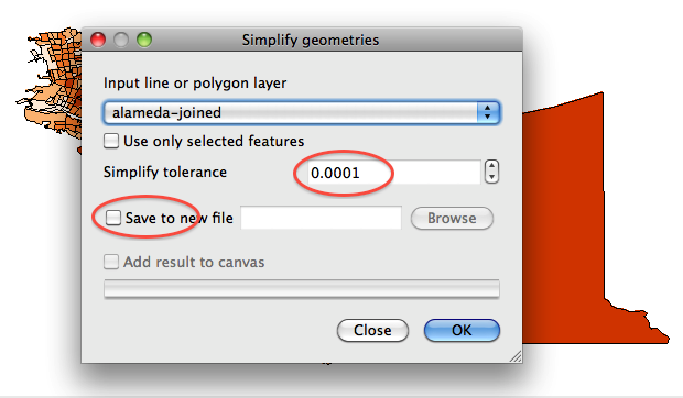
Click on the layer you want to simplify and zoom out so that you can see the entire layer. It should be a boundary layer (tracts) or a line layer (roads).
Go to the Vector menu -> Geometry tools -> Simplify geometries. This opens a window and your layer should be selected in the Input line or polygon layer drop down menu. It it’s not, select it.
Next, look for the Simplify tolerance field. This measurement is in degrees so you want to use a really small number. The default of 0.0001 is a good place to start.
Check Save to a new file and create a new folder and a new file. Click OK. A new window will tell you how many vertices were removed. It should have removed somewhere between 70 percent to 90 percent of the original vertices. Close the window.
You will need to add the layer to the project. Once that’s done, zoom into the map so you can see a lot of detail. You may see some polygons that don’t align perfectly or shapes that are a little distorted. Mine looks pretty good:
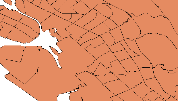
If you have a lot of gaps or distortion, you have to make a judgement call. Users may never see small gaps once this is placed on a map. If you have large gaps, you should try again with a smaller setting.
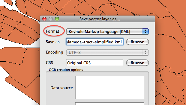
Export a KML file
Both GeoCommons and Fusion Tables support KML files. KML is a single file that is essentially an XML version of the SHP file.
Right-click on the simplified layer and select Save as… Change the format to Keyhole Markup Language (KML) in the window that opens.
Enter a new file name and click the Browse button to specify the save location. Click OK.
Analysis Tools
Frequently, you will want to find out how two sets of data relate to each other. There are several plugins that will help you do just that.
Points in Polygon
The Points in polygon tool will compare a point layer and a boundary layer. It counts the number of points for each boundary and creates a new shape file that contains a column with the resulting data.
Create a new project with an Alameda tracts layer and a toxic releases point layer.
Go to the Vector menu -> Analysis Tools -> Points in Polygon. This opens a window and your polygon layer and your points layer should be selected.
Change the Output count field name to TOX_REL_CT for toxic release count.
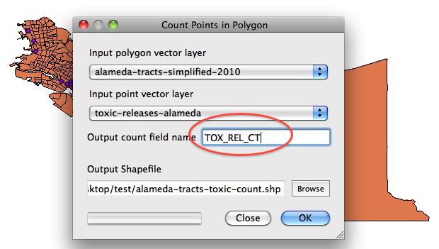
Click Browse to save to a new file and folder. Click OK. QGIS will save the file and ask if you want to load it into the project. Click Yes.
Right-click on the new layer and open the Attributes table. Scroll all the way to the right and you will see the new column. If you wanted, you could color code the new layer based on the count data.
Buffer
The Buffer tool allows you to create a new boundary a specific distance around shapes. For example, rivers often have development buffer zones to protect them from development. By creating a buffer along a river (a line), you can see if development has encroached and threatens the river. Or you may want to see how how many toxic release sites (points) are within 1000 feet of a school (points). Let’s look at this last example.
Before we start, we have to change the projection on our shape files and re-save them in order for the Buffer operation to work. QGIS’s ‘on the fly’ projection feature will not work.
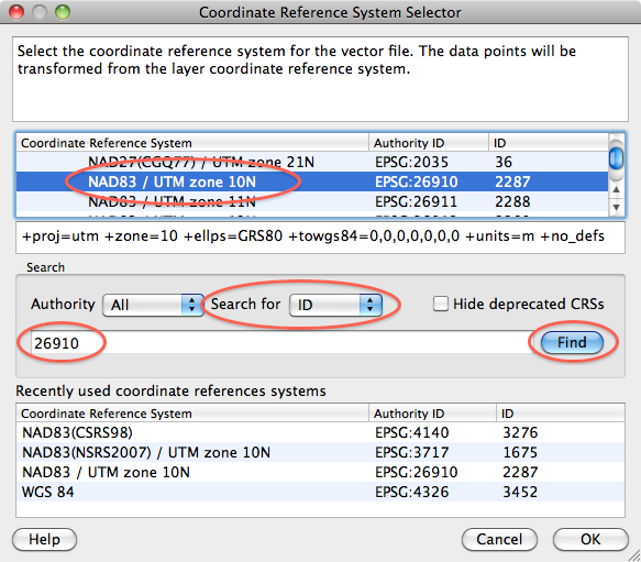
Right-click on the alameda tracts layer and select Save as… Make sure the format is set to ESRI Shapefile. Then name it alameda-tracts-utm and save it in a new folder. UTM stands for Universal Transverse Mercator and is the projection we will use.
Look for the CRS field. It should say Original CRS. Click the Browse button next to it. Type 26910 in the search field. Make sure you’re searching by ID then click the Find button. The NAD83 / UTM zone 10N projection will be highlighted. Click OK.
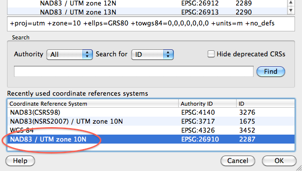
Now lets do the same thing with the toxic releases layer. Right-click and select Save as… Make sure the format is set to ESRI Shapefile. Then name it toxic-releases-utm and save it in a new folder.
Click the CRS Browse button. This time NAD83 / UTM zone 10N projection will be in the Recent CRS area. Select it and click OK.
Create a new project, load the alameda-tracts-utm file and then the toxic-releases-utm file.
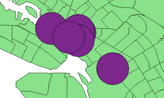
Go to the Vector menu -> Geoprocessing Tools -> Buffer(s). This opens a window and your toxic-releases-utm layer should be selected.
Setting the Buffer distance can be a bit tricky. The UTM projection only uses meters. Let’s set up a 1,000 meter buffer by entering it in the Buffer distance box. If you want to create a buffer in feet you have to convert. For example, a 1,000 foot buffer is 304.8 meters.
Save the output shapefile as toxic-buffer-utm in a new folder and click OK. Add the layer to the project when prompted and close the buffer window. We’ll add some schools in the next section.
GeoCoding
The MMQGIS plugin offers a lot of tools and one of the most useful is the Geocode from Google. It’s simple to use but the process may take a while so if you get the spinning beach ball of death, wait it out. Also, Google limits the number of addresses you can geocode, which can cause large datasets to fail.
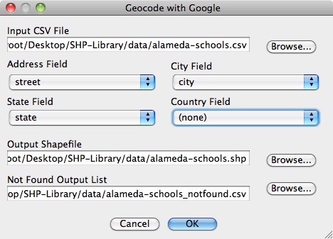
Go to the Plugins menu -> mmqgis -> Geocode with Google. This opens a new window. Click browse and navigate to the alameda-schools.csv file in the data folder.
The plugin auto-detects the street, city and state fields. Hit OK and wait for this to process. Don’t be surprised if it takes 10 minutes or longer based on the number of addresses.
When it’s finished, a layer will appear. The final thing we need to do is change it’s projection. Go to the File menu ->Project properties. Check Enable ‘on the fly’ CRS transformation. Select the NAD83 / UTM zone 10N projection Recent CRS area and click Apply.
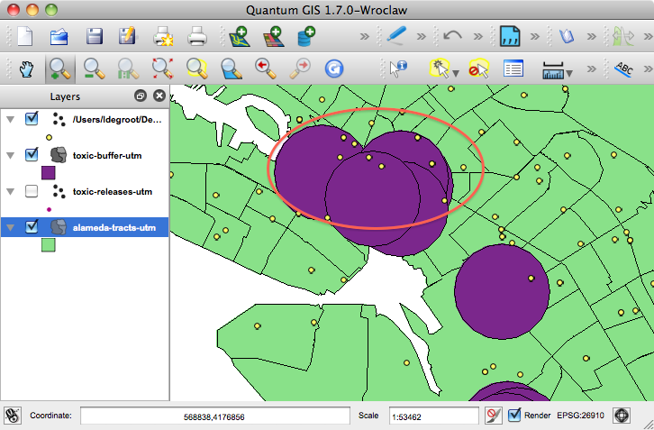
Now you can zoom in and see where schools overlap the buffer areas. You could also use the Points in polygons tools to get an accurate count.
NOTE: We’ll continue updating this section as time permits
Export for print
QGIS export happens in the print dialog box. You can save your map as an image or one of two formats than can be read in Adobe Illustrator.
Go to the File menu and select New Print Composer. Set your page size and orientation.
Next, click the Add Map button and click and drag a box to add the map to your page. You can resize by grabbing the corner adjustment handles.

Both PDF and SVG can usually be opened and edited in Illustrator. Just know that the file conversion can cause things to go a little wonky at times.

Export an interactive map
QGIS plugins allow you to make interactive image maps. While this isn’t exactly the best option for a great user experience, it can work in a pinch. We’ll also use some JavaScript libraries to add some nice tool tips.
Go to the Plugins menu and select Manage Plugins. Make sure the the HTML Image Map and the fTools plugins are checked.
Hide both of the point layers in your project.
Click on the layer with the joined data to select it.
Go to the Plugins menu and select HTML Image Map Plugin -> Image Map.
Set image size
This plugin exports the entire Layout area so setting the image size correctly at the start can save you a lot of time later on. Look for the Set Map/Image size area.
Change the Width to the width of the content area on your target web page. In my case, it’s 620 pixels.
Click the Set button and the size of the Layout area changes. Go to the View menu and select Zoom full. This ensures that the map takes up the maximum amount of space.
This is a vey horizontal map and we don’t want to export the white areas. Change the Height to 350 pixels and click the set button. The layout area changes again but this time the map gets a lot smaller.
Go to the View menu and select Zoom full. That’s better but I want to get as close as I can to the edges. Change the Height to 350 pixels and click the Set button. Go to the View menu and select Zoom full.
While this is not the most scientific way to set your image size, it works. With practice, it usually only takes a few tries to get right.
Set the save location and filename
I have included a a collection of files in the Export folder from Tim Henderson’s tutorial on this same subject. I have edited the files to refine the look and make it easier for beginners to update. The Export folder has five files that you can reuse, so you might want to make a copy now.
Click the Browse button and navigate to the Export folder.
Save the file as alameda-total-housing.
Set the mouse interaction
This plugin allows you to create many mouse actions. We only want to use the onMouseOver attribute.
Uncheck all the boxes except for onMouseOver and set the drop-down menu to TOTAL_HOUS.
When you’re done it should look like the image below. Click OK and the plugin exports a set of files.

Edit the html
Navigate to the Export folder in a finder window and open mymap.html in a text editor like TextMate or TextWrangler. All the instructions we are about to go through are duplicated as comments in the HTML file.
Look inside the <head> tags. The first two scripts import two JavaScript libraries. You may have to update the URLs when you load them on your Web server.
The fourth script is where you add your ToolTip text.
The <style> tag contains the CSS used to style the map text. You can change these to match the styles you use on your site.
Next look in the <body> tag for the following code and update the text. It should be around line 38.
<h3 class="grhead">Add your headline here</h3>
<p class="chatter">Add explainer text for your map here.</p>
Next, edit the colors in the key. Look for the table and find each instance of something that looks like this: "#feedde". These are your hexadecimal colors in sequential order (if this is new to you, read this). Each color is followed by label text (label 1, etc.) edit these to match your classes.
Find and edit your Source text.
Next, perform a Find for my-map and Replace it with the name of your file. In this case it will be alameda-total-housing. Four changes should be made.
Remember to Save.
Now for the final step. Open the html file that the plugin created in a text editor. It should be called alameda-total-housing.html
Look for the code that starts with <area shape="polygon". It should be around line seven. These are the coordinates for all of your polygons. We need to get them into the my-map.html file.
Select all the code from <area shape="polygon" all the way to the bottom but stop before the </map> tag. Copy the code and return to my-map.html.
Find and select the text PASTE AREA POLYGON CODE HERE, then Paste the code.
Save the code and open the page in a web browser. It should look like this:
About this Tutorial
This QGIS tutorial was written for instruction during an Intro to Data Visualization course at the U.C Berkeley Graduate School of Journalism and for workshops held by the Knight Digital Media Center.
Republishing Policy
This content may not be republished in print or digital form without express written permission from Berkeley Advanced Media Institute. Please see our Content Redistribution Policy.
© 2020 The Regents of the University of California