April 18, 2013
By Mitzi Mock
We’re only two weeks away from our data journalism symposium. Have you registered, yet?
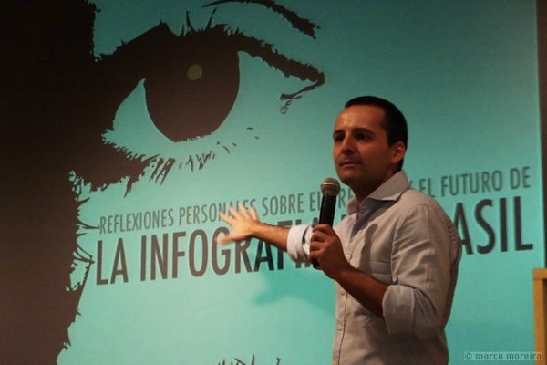
In the meantime, we’ve been checking in with our symposium speakers, who are giving us a preview of their presentations and offering their musings on the field of data visualization. Earlier this week we spoke to Code for America’s Catherine Bracy. Today we spoke with University of Miami communications professor Alberto Cairo. He is a visual communications expert and the author of The Functional Art: an Introduction to Information Graphics and Visualization.
Alberto Cairo
Q: What are the most common mistakes people make when they first start making infographics?
A: The most common mistake many people make is confusing infographics with illustrations. Sometimes students come to my class thinking they’re here to learn how to draw. Their projects will feature a big picture in the middle with numbers around it. But there’s no clear story or insight into the data.
Data visualizations are different than infographics because they usually include an interactive component. However, many of the pitfalls are the same. People get so caught up in making something look cool with sparkling lights, animations or other fancy interactive features that they forget that good data visualization is first and foremost a communication tool.
Sure, I love a beautiful presentation and innovation is important. But the mark of a good infographic or data visualization project is its usability, its clarity and the story it tells. This isn’t art. This type of communication is an act of journalism: an effort to transform complex data into something you can extract meaning from.
Q: What ideas will you explore in your symposium presentation?
A: I’m still working on it, but there are a few themes I want to touch on. Generally speaking, I want to look at the application of journalism skills and journalistic values within other academic domains. Whether it’s a scientist or an engineer, at some point these experts will have to communicate to the public. They are often reluctant to present information at the layperson level because they are afraid it will dampen the integrity of their work. But this reluctance creates a gap between scientists and the general public. Thinking like journalists and applying thoughtful storytelling tools could be a useful way for the science community to bridge this gap.
Q: Are there other topics you hope to hear about from other speakers or discuss with those in attendance?
A: I am hoping to hear more discussion about the ethics of data journalism. Right now there is a big craze around data, especially the big data sets private organizations are gathering and making open to the public. But I’ve heard less discussion about the ethics of sharing this information: how should we present this data? Are particular graphic forms more appropriate than others? I’m less interested in hearing about the latest data visualization tools and more interested in discussing the underlying thinking behind data journalism projects.
Q: What are some good examples of infographics you’ve seen in the past few months?
A: You should check out Periscopic’s infographic on U.S. Gun Deaths. I just wrote about this project for Peachpit. The infographic compares the number of gun deaths in a year with the potential number of stolen years of life.
Often the goal with infographics is to illustrate data with precision. But the fact is that many data sets have elements of uncertainty, and this project is an example. This visualization is a good place for us to begin a conversation about the ethical and logistical challenges of dealing with doubt, variation and randomness in data.

