Introduction
Online story packages usually contain multiple sections or formats and they take a variety of forms on the Internet. Some borrow heavily from old media conventions, while others try to define what kinds of storytelling are native to a digital format:
- Some stories are presented in a linear fashion similar to narratives in traditional media like TV or radio. They may be divided into segments or chapters like a multi-part newspaper story, but the user is expected to go through the segments in a predetermined sequence. Alternatively, non-linear stories are sliced into topical segments and it’s up to the user to decide how to navigate the package.
- Placing multimedia elements in a story is approached several different ways. Sometimes text drives the story and multimedia components like video, graphics or photo slideshows are placed put off to the side. In other cases multimedia is embedded inside a text story (or even embedded in a video story as interactive elements in the video) or are part of an immersive experience.
- In many stories one type of media is dominant, usually text or video or photo slideshows with audio, but sometimes data, graphics or games, and other media forms are secondary. Other story packages draw on many different media forms equally, with different parts of the story told in the type of media most appropriate to that kind of content.
Here are examples of different approaches to online story packages, grouped into general categories that define how they’re presented or organized, or by the type of media that is dominant in the narrative (and many of the story packages combine elements from several different categories).
Story Packages Section
This first section explores different approaches to organizing a package of stories, such as linear or non-linear, embedded or ancillary multimedia, comprehensive or immersive, and the different ways multimedia is integrated into each package.
Linear Stories
These packages use a traditional narrative structure with a beginning, middle and end to the story, although they are often divided into chronological “chapters” or “parts.” Stories that re-create events are most often told in this format.
Here are some examples:
Uprooted
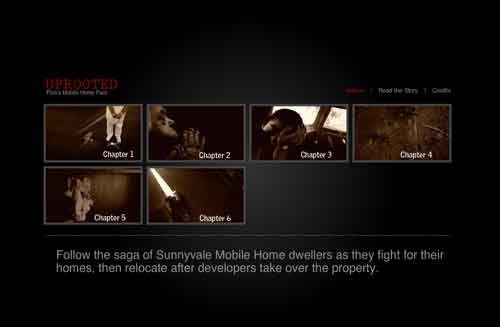
Uprooted is a six-part story done by the San Jose Mercury News in December 2007 on mobile home dwellers who were forced to relocate after a developer purchased their mobile home park.
Christmas Tree
The Christmas Tree refers to a form of multimedia storytelling in which the main story is text presented as a linear narrative, while links to multimedia elements like videos, photo slideshows, maps and graphics are just add-ons, placed to the side of the main text story like ornaments hung on a tree (credit to Regina McCombs, formerly a multimedia producer with the Minneapolis Star Tribune and now with the Poynter Institute, who first used the term “Christmas Tree” in describing this kind of story).
Because the multimedia is stacked on the side, it isn’t designed to be read in an integrated way with the text narrative (unless links to the multimedia are also embedded in the text story). So the multimedia is usually viewed after reading the main text story. Thus multimedia is placed a secondary role as a decoration for the main text story.
Here are some examples:
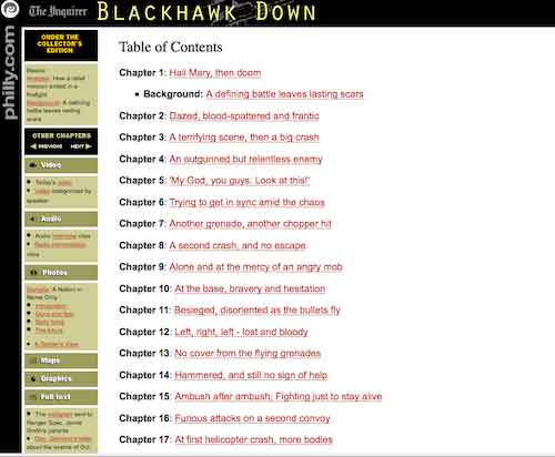
Blackhawk Down
The Philadelphia Inquirer published the Blackhawk Down series in 1997 on the ill-fated U.S. military mission to Somalia.
The text stories are in a column on the right, while the multimedia elements – video, audio, maps and graphics – are hung on the left (although links to the multimedia also are embedded in the text stories, so this story package is an early version of the embedded multimedia approach as well).
A Toxic Pipeline is a Pulitzer-prize-winning series published by the New York Times in 2008 about poisonous pharmaceutical products being exported out of China. The print stories are in the main column on the left, while the multimedia – videos, graphics and a map – are stacked on the right.
Fracking is a series of stories that ProPublica, the investigative journalism project, has done on the environmental threat posed by this form of natural gas drilling. The main stories are text and are in the wide center column on the page. The multimedia elements are stacked in the column on the left (scroll down the page to see them).
Other investigative series published by ProPublica usually follow the same format.
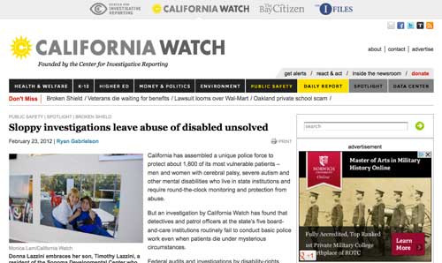
Sloppy investigations leave abuse of disabled unsolved is part of a series by the Center for Investigative Reporting on the failure of police at state institutions for the developmentally disabled to properly investigate patient abuse. The stories were published on CIR’s California Watch website.
The multimedia is in a column on the right, along with links to related stories and to versions of the article publshed at other online news sites.
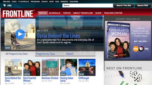
Frontline, the public television documentary show, uses the Christmas Tree structure for its stories, but the video is the main element or trunk on the page. Select a video story and below it you’ll see additional multimedia segments, such as interactive maps or graphics, photo slideshows, other videos or text stories.
Embedded Multimedia
In this form of storytelling, there is a main story, usually text, told in a linear fashion, and with multimedia elements integrated into the main story so they’re viewed at appropriate points in the narrative.
The multimedia usually is embedded in the story rather than being pushed to the side. Thus the multimedia is designed to be viewed while the story is being read, not afterward.
The result is a more seamless transition between text and video or graphics and back to text, with the multimedia a part of the narrative, rather than separated out.
Here are some examples of embedded multimedia stories, all drawn from the New York Times, that show the evolution of this form:
The Times published two stories on a Mexico bribery case involving the Wal-Mart company in which multimedia was integrated into the main story.
In the first story published in April 2012, links to documents are embedded in the main text story.
In the second part published in December 2012, the main story again is text but with many more multimedia elements – photos, an interactive map, text documents – added in a column to the right.
And unlike the Christmas tree approach in which the multimedia is just stacked in a column, as you scroll through this story each of the multimedia elements appears on the right at the relevant point in the main narrative.
A preview video also is included at the top of this story.
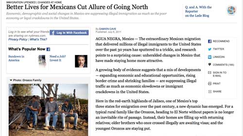
A slightly different approach was taken in the story package Better Lives for Mexicans Cut Allure of Going North, published in July 2011.
The multimedia was displayed in a stack to the left of the story and at the top.
But as you scroll down through the story different multimedia elements open up, so you can view them at relevant points in the story.
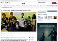
In Virtual Play, Sex Harassment Is All Too Real, published in August 2012, links to multimedia such as videos or graphics are embedded in the main text story.
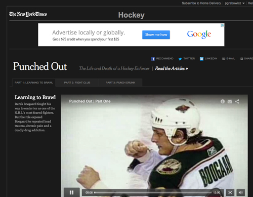
Punched Out, a story package published in December 2011 about a hockey player “enforcer” who suffered brain damage and drug addiction and died, relied not on text for the main narrative but instead on a series of videos.
Other multimedia elements, such as a slideshow, graphics or shorter videos, are highlighted as the main video plays.
If you click on these other multimedia elements, the main video will pause so you can view the secondary multimedia and then resume play of the main video.
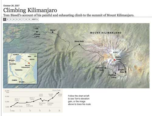
Finally there’s Climbing Kilimanjaro, an interactive graphic the Times produced in October 2007.
The graphic is a fly-over views of the Tanzanian mountain on which multimedia elements like videos or photos with audio are keyed to different points on the climb up to the peak.
Snow Fall
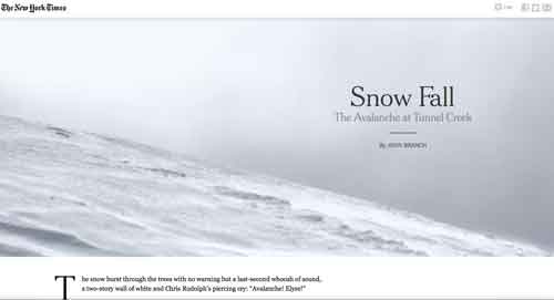
All of these different approaches to multimedia culminated in Snow Fall, a story the New York Times published in December 2012 about an avalanche in the state of Washington that killed a group of skiers. In this story the multimedia was thoroughly integrated into a long text narrative.
The story was widely praised for how it carefully blended the multimedia into the text narrative. The multimedia was designed to be viewed while reading the main story, rather than afterward (which is the Christmas Tree approach).
Thus animations and other graphics would slowly appear at relevant points in the text story as you scrolled through it. In some cases the background color of the text story would gradually change to match the color of a graphic that would load as you scrolled down through the narrative.
The goal was to “find ways to allow readers to read into, and then through multimedia, and then out of multimedia. So it didn’t feel like you were taking a detour, but the multimedia was part of the one narrative flow,” New York Times Graphics Director Steve Duenes explained in an interview with Poynter Online.
Snow Fall won both a Pulitzer Prize and a Peabody Award.
There were a number of inspirations for Snow Fall:
- an ESPN story on former Pittsburgh Pirates pitcher Doc Ellis, which used the curtain.js jquery library to embed graphics in a text story (one of our students at the UC Berkeley Graduate School of Journalism also picked up on the curtain.js jquery library and used it to integrate photos and graphics into a long text story on homelessness in Richmond, California). The Doc Ellis story also used parallax scrolling, in which the foreground scrolls by more quickly than the background, creating a sense of three dimensional depth (the technique has been used previously in animations and video games).
- a text and photo essay called Glitter in the Dark published at the Pitchfork music site
- a wedding announcement by a couple of designers/graphic artists in New York
After the publication of Snow Fall, the New York Times announced it was implementing a new design for articles that has some of the embedded multimedia approach of Snow Fall.
Aaron Pilhofer, editor of interactive news at the New York Times, also did a mockup of what the story would have looked like if it had been published using the Times’ traditional story template (which is the Christmas Tree approach).
Sources and Resources for Snow Fall:
- What the New York Times’s ‘Snow Fall’ Means to Online Journalism’s Future – Rebecca Greenfield, Atlantic Wire, 12/20/2012
- How The New York Times’ ‘Snow Fall’ project unifies text, multimedia – Jeff Sonderman, Poynter, 12/20/2012
- ‘Snow Fall’ Isn’t the Future of Journalism – Derek Thompson, The Atlantic, 12/21/2012
- ‘Snow Fall’ Tells a Story About an Avalanche and a Newspaper’s Digital Progress – Public Editor’s Journal, New York Times, 12/27/2012
- How We Made Snow Fall: A Q&A with the New York Times team – Source, 1/1/2013
- Inside “Snow Fall,” the New York Times multimedia storytelling sensation – Nieman Storyboard, 3/29/2013
- Why Design Matters: If Snow Fall Were Published in a Standard Template – Aron Pilhofer, aronpilhofer.com, 5/10/2013
- Sorry, ‘Snow Fall’ isn’t going to save the New York Times – Pandodaily 5/13/2013
- Newsweek.com Redesign Aims to Be ‘Snow Fall’ on a Weekly Basis – Ad Age, 5/15/2013
- The New York Times Told Me to Take This Down – Cody Brown, 5/21/2013. Cody Brown put up a YouTube video demonstrating how he used a tool called scroll kit to build a replica of the Snow Fall multimedia package in about an hour, prompting copyright and other objections from the New York Times.
- Everyone Secretly Hates “Snow Fall” – Choire Sicha, The Awl, 5/22/2013
- A Whole Lot of Bells, Way Too Many Whistles: Multimedia-laden features like “Snow Fall” and “The Jockey” are bad for the Web and bad for readers – Farhad Manjoo, Slate, 5/15/2013
- Snowfallen: Just because you can, it doesn’t mean you should – Bobbie Johnson, Medium, 7/13/2013
- Snow Fail: Do Readers Really Prefer Parallax Web Design? – Eric Jaffe, Fast Company, 12/19/2013
More Embedded Multimedia Stories: The Snow Fall Effect Takes Off
After the publication of Snow Fall, other media organizations produced a number of multimedia stories that built on the Times project. incorporating some of the same devices and adding new techniques. They included:
Cycling’s Road Forward – Washington Post
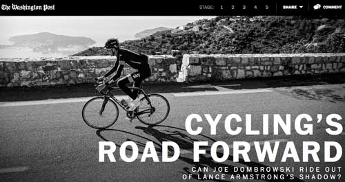
Cycling’s Road Forward is a five-part Washington Post story published on February 27, 2013, about a cycling phenom working to overcome the shadow cast on the sport by discredited cyclist Lance Armstrong.
The story is presented in a format similar to the New York Times’ Snow Fall project with multimedia elements embedded in a long text piece, although the interactivity is not nearly as sophisticated and the transitions between text and multimedia not as elegant as in the New York Times piece. Poynter did an interview with Post information designer Wilson Andrews about the project.
Six : 01 – Memphis Commercial Appeal
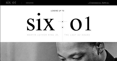
Six : 01, produced by the Memphis Commercial Appeal, is the story of the 32 hours leading up to the assasination of Martin Luther King Jr. in Memphis, Tennessee in April 1968. The story is told on a single page as a long vertical scroll of text, which gives a sense of movement through the story as you scroll down. Photos and videos are integrated as elements that appear in the flow of the text.
The story also has an element of the timeline approach to storytelling, with a countdown of the hours/minutes leading up to the assasination displayed in a column on the left as you scroll down through the story.
The story was published on April 4, 2013, the 45th anniversary of the killing of Martin Luther King Jr.
Sources and Resources for Six : 01
- Design isn’t just for the big guys: In Memphis, the Commercial Appeal retells MLK’s last 32 hours – Nieman Journalism Lab, 4/9/2013
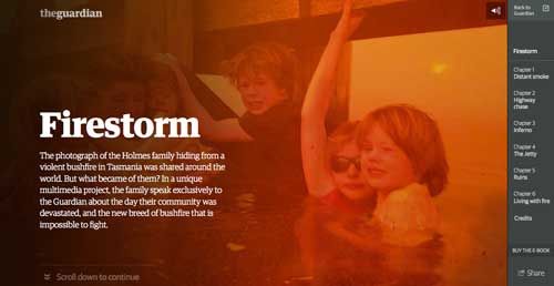
Firestorm is a story by The Guardian about a huge brush fire that hit the Tasmanian Peninsula in Australia and how one family survived by fleeing their home to a lake where they cowered under a jetty.
The story, published on May 22, 2013, is told primarily with text, but as you scroll down through the text, photos, videos and a map fade in and out in the background. Periodically the text will give way to a video or audio clip, usually an interview. The story also is broken into six chapters.
Bounced Around – Chronicle of Higher Education
Bounced Around, published by the Chronicle of Higher Education on June 3, 2013, is the story of a college basketball coach who has had 12 coaching jobs in 16 years. The story is mainly text that you scroll down through to reveal photo slideshows and animated graphics.
Bulger on Trial – WBUR
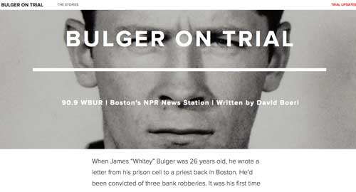
Bulger on Trial, produced by WBUR, the NPR station n Boston, is the story of James “Whitey” Bulger, the mobster charged with 19 murders who was on the lam for more than 15 years before being captured in 2011. The story, published on June 5, 2013, uses the familiar scrolling text into which are integrated photos, audio clips and videos. The project also includes links to a timeline, a map of the murders, documents from the trial and other stories, thus incoporating some of the non-linear approach to multimedia storytelling.
The story was produced using Creatavist, a platform for doing multimedia story developed by the Atavist site that promotes long-form multimedia storytelling.
Sources and Resources for Bulger on Trial:
- WBUR partners with Atavist to tell the story of Whitey Bulger and templatize feature presentation – Justin Ellis, Nieman Journalism Lab, 6/5/2013
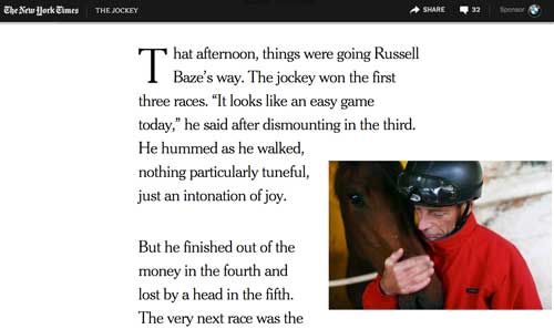
Jockey was an eight-part New York Times story published on August 14, 2013, about the life of a California jockey, which employed some of the same techniques used in Snow Fall to embed multimedia in a text story. Many of the story segments had longer video pieces that appeared seamlessly as you scrolled through the story.
Sources and Resources for Jockey:
- New York Times Weaves Custom Ads Into ‘Snow Fall’-Like ‘The Jockey’ – Ad Age, 8/13/2013
NSA Files: Decoded – The Guardian
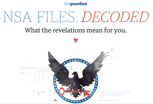
NSA Files: Decoded is a six-part online news story published by The Guardian on November 1, 2013, on the NSA files leaked by NSA contractor Edward Snowden. The narrative combines text with more than 30 short video interviews that autoplay as you scroll through the story. There also are a number of interactive or animated graphics, data visualizations and original source material documents embedded in the narrative.
“This piece was designed to be read, or consumed, as a whole. You can’t take the writing out of it and have it work the same. You can’t take the videos out of it and have it work. You can’t take out the graphics and have it work. It’s meant to be consumed as an entire project, with all these different parts being seen, seamlessly, to one another.”
– Gabriel Dance, interactive editor at The Guardian. Source: Nieman Journalism Lab
The NSA Files project also provides more opportunities for readers to intereact with the story, such as by manipulating some of the graphics.
Sources and Resources for NSA Files: Decoded:
- The Guardian’s “NSA Files Decoded” and Multimedia Journalism – Khoi Vinh, Subtraction, 11/1/2013
- Q&A: The Guardian’s Gabriel Dance on new tools for story and cultivating interactive journalism – Nieman Journalism Lab, 11/25/2013
- The Guardian’s NSA Files Decoded: Did You Really Read It? – Threespot Media blog, 12/4/2013
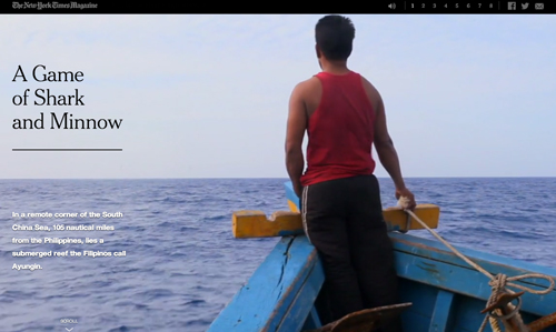
A Game of Shark and Minnow is a multimedia story published by the New York Times Magazine on October 17, 2013, about a garrison of eight Fillipino troops on a World War II era ship run aground on a reef. They are stationed there in a face-off against China as part of a geopolitical struggle over the region. The presentation featured full-screen videos and maps embedded in the eight part text story.
More Examples of Stories Using the Embedded Multimedia Format
- His Saving Grace – Chicago Tribune, 2/14/2013
- Out in the Great Alone – Grantland, ESPN, 5/9/2013
- Machines for Life – Pitchfork, 5/14/2013
- Greenland Melting – Rolling Stone, 7/25/2013
- The perils at Great Falls – Washington Post, 8/10/2013
- One Dream – Time, 8/15/2013
- Gorgeous Glimpses of Calamity: Man-made perils to the universe’s garden of life are evident from space – New York Times, 8/16/2013. An opinion section story.
- The Road: Albemarle County’s three-decade fight over the Western Bypass isn’t over yet – c-ville, 8/28/2013
- The Geeks on the Front Lines – Rolling Stone, 9/10/2013
- Sea Change: The Pacific’s Perilous Turn – Seattle Times, 9/11/2013
- China’s Maritime Disputes – Council on Foreign Relations, 9/15/2013
- How Detroit went broke: The answers may surprise you – and don’t blame Coleman Young – Detroit Free Press, 9/15/2013. In this story a lot of data visualizations and graphics are embedded in the story, along with some videos and photos.
- Concrete Risks – Los Angeles Times, 10/13/2013
- Ring of Fire: Why Our Military’s Toxic Burn Pits are Making Soldiers Sick – The Verge, 10/28/2013
Non-Linear Multimedia Narratives
This approach to storytelling emphasizes the non-linear, interactive nature of the online experience – on the Internet people value having choices.
So instead of a single linear narrative that leads someone through a story, the story is broken up into topical segments. Thus a story package may include profiles, background information, history, financial implications, etc., as well as a main narrative. The user gets to choose how to navigate the story by selecting the segments of most interest.
Each segment still has its own narrative structure. And in most cases each section is told in the type of media most appropriate for the content in that segment (for example, video for a segment of a story in which there’s a lot of action).
Here are some examples:
Touching Hearts
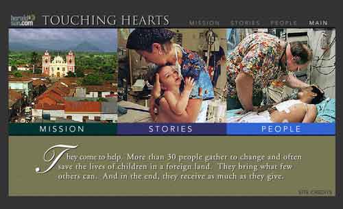
Touching Hearts was a story package published by the Durham Herald Sun in 2001 about a medical team from Duke University that went to Nicaragua to perform surgeries on children. The winner of a 2001 Online News Association award, it was produced in Flash by Joe Weiss, a photographer who later created the SoundSlides application to make the production of photo/audio slide shows much easier.
The project has three parts:
- The Mission – background on the surgeons’ mission to Nicaragua told mostly in text and graphics
- Stories – photo slideshows with audio that tell the emotional stories of the doctors efforts to treat the children
- People – quick profiles of the medical team and the children done in text, with thumbnail photos of the children
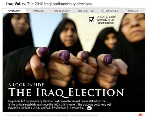
Iraq Votes: A Look Inside The Iraq Election was an online news package done by the Associated Press in March 2010. The story, produced in Flash, was divided into six sections, with each section presented in the type of media most appropriate for the content of that section:
- Overview – a video introduction to the election and the Iraqi voters
- Timeline – interactive timeline of the events leading up to the election
- The Election – graphic with text explaining the process for voting
- The Politics – text with thumbnail photos of the main parties and candidates
- Vote Voices – video interviews with voters
- Results – a graphic showing the results of the election
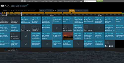
Black Saturday produced by the Australian Broadcasting Corporation is about a horrific wild fire in the state of Victoria in 2009 that killed 173 people and destroyed more than 2,000 homes. The story is told in video interviews with survivors and the storyline can be followed by topic, by the people being interviewed, on a timeline, or on a map.
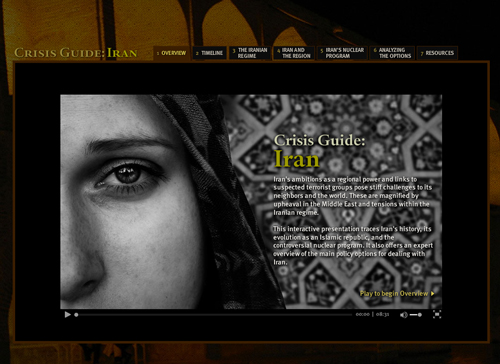
Crisis Guide: Iran
Crisis Guide: Iran was published in October 2011 by the Council on Foreign Relations. The multimedia project examined Iran’s history, the internal politics of the ruling Islamic regime, its role in the Middle East, its nuclear program and the different approaches the international community has taken to dealing with Iran. Each section is told in different types of media, including videos, photo slideshows with audio, graphics and interactive timelines. The project was produced by Brian Storm’s MediaStorm multimedia company and won an Emmy award in 2012.
Sources and Resources for Crisis Guide: Iran
- Crisis Guide: Iran – MediaStorm, 10/4/2011. A description by MediaStorm of how it created this multimedia project for the Council on Foreign Relations.
In-Depth Packages – The Kitchen Sink
These are story packages, usually organized as non-linear multimedia narratives, which are extremely comprehensive and include many different aspects of the story and different types of content.
This approach can be very valuable for people with a particular interest in an issue or for setting the agenda with an in-depth package on a topic of general interest to a community.
But good organization is critical to an in-depth package, as it can add so many elements – the kitchen sink problem – that it seems overwhelming and difficult to navigate for people unfamiliar with or who have only a passing interest in the topic.
Here are some examples:
Empty Cradles
Empty Cradles is a news package on infant deaths done by the Milwaukee Journal Sentinel in January 2011 that won several major national awards. It includes eight main topical sections, eight multimedia elements including charts, maps, a quiz, a panorama and a timeline, 13 videos or photo galleries, a blog, personal stories by readers, opinion columns, editorials, and more.
Sources and Resources for Empty Cradles:
- Behind the scenes of JSOnline’s “Empty Cradles” – Innovative Interactivity, 9/27/2011
Rethinking Immigration
Rethinking Immigration was a package of stories published by the Toronto Globe and Mail in 2012 as part of its “Our Time to Lead” series of in-depth reports on important topics for Canadians. The immigration package included numerous interactive graphics, videos and text stories, a poll of reader attitudes and comments on immigration that were plotted on an interactive chart, and a form for people to submit their own stories about their experiences with immigration. The package drew more than 2,400 comments.
Sources and Resources for Rethinking Immigration:
- Globe and Mail Series Uses Multimedia to Engage Readers – Editor & Publisher, 3/6/2013
Immersive Multimedia
Immersive multimedia stories put the viewer in a seemingly three dimensional representation of a story or other visual space that engages you in a narrative.
The narrative unfolds as the user explores the space, with the user having some control over how to navigate the story.
Immersive stories are produced using several different formats including the Flash animation program, interactive videos or HTML5 and JavaScript.
Here are some examples:
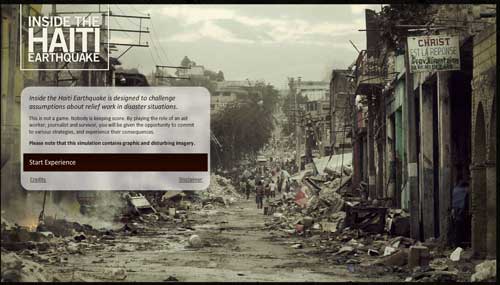
Inside the Haiti Earthquake
Inside the Haiti Earthquake is a story about the devastating earthquake that hit Haiti in January 2010 told through a sequence of short video clips. You initially choose whether to be a journalist, an aid worker or a survivor, which will determine which videos are shown and thus change your perspective on the earthquake. After each video clip you’re presented with several options for further exploration of the site of the earthquake, with each option playing a different video clip. Thus this video also integrates elements of the game approach to storytelling.
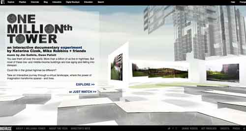
One Millionth Tower
HIGHRISE: One Millionth Tower was produced in 2011 by the National Film Board of Canada. You explore a 3D representation of a highrise, clicking on different areas to access stories that envision how different parts of the highrise could be redeveloped. The project is done in HTML5 and JavaScript using the WebGL graphics library.
This is the third installment of the multi-year HIGHRISE project about life in a highrise. The others were Out My Window in 2010 and The Thousandth Tower also in 2010. In 2013 an interactive documentary, A Short History of the Highrise, was produced for the New York Times’ Op-Docs project.
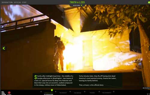
Truth & Lies
Truth & Lies: the last days of Osama bin Laden is a story produced by the Canadian Broadcasting Corporation in September 2011 about the U.S. Navy Seals mission that killed Osama bin Laden in May 2011. The story is told with a series of interactive graphics, text boxes and photos laid over videos and video recreations that run in the background as you select the interactive elements.
The Block
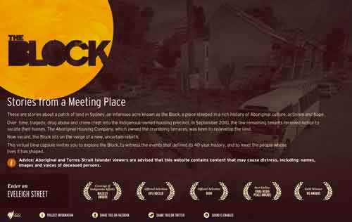
The Block was produced by SBS Online, Australia’s indigenous film channel, in July 2012 using Flash. The project immerses you in a one-acre section of Sydney, Australian, that had been a famous meeting place for the local Aboriginal community before it was plagued by crime and drugs and fell into decay. Now there are efforts to revitalize it.The story unfolds by exploring the streets in the area and clicking on links to play videos.
Hollow
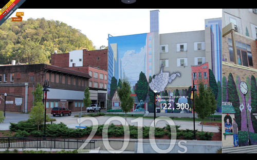
Hollow combines beautiful photographs, videos and graphics to tell the story of the decline of a small town community in West Virginia. The project was launched in June 2013 by Elaine McMillion while she was an MFA student at Emerson College. You scroll vertically to navigate through the six different segments of the story, but as you do the multimedia elements are presented as a horizontal scroll.
Sources and Resources for Hollow:
- Hollow: An Interactive Documentary Made While In School, But It’s No Student Film – PBS POV Blog, 9/6/2013
Sources and Resources for Immersive Multimedia
- Transition to Digital Storytelling: Games and Immersive Environments – Berkeley Advanced Media Institute tutorial
- Moments of innovation – Immersion – a history of immersive storytelling produced by the IDFA Doclab at MIT
Narrative Forms
This next section explores the many different narrative forms being used to tell stories.
The narrative forms range from visual narratives, interactive videos, interactive audio and illustrations and games, to graphics, data visualizations, timelines and maps.
Usually different forms are used for different elements of a story package, such as the main story (liner or non-linear), embedded multimedia in linear story package or different segments of a non-linear package.
In some cases the entire story is told in a single narrative form.
Visual Narratives
These are stories in which the main narrative is either a video or a photo slideshow with audio. The story can be a single video or slideshow or it can be divided into multiple parts. Either way it is almost always presented as a linear narrative.
Here are some examples:
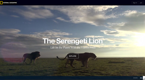
The Serengeti Lion is a National Geographic feature produced on August 2, 2013, that is a series of full screen photos about 24 different aspects of the life of the African lion. You scroll horizontally through the photos, each of which can be clicked on to display a photo gallery or play a video or audio clip with more information about that part of the lion’s life. Text is limited to just headers for each segment.
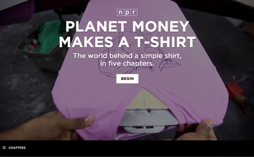
Planet Money Makes a T-Shirt
- Collaborating on the T-Shirt Project – Source, 12/2/2013
- How and Why Cross-Disciplinary Collaboration Rocks – Source, 1/2/2014

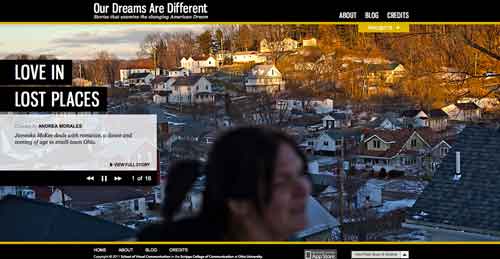
Our Dreams Are Different
Our Dreams Are Different was produced by visual communications students at the Scripps School of Journalism at Ohio University in 2011. It is part of the Soul of Athens project began in 2007, which documented what made life unique in Athens, Georgia.
Our Dreams are Different is a package of 16 stories, produced as videos or photo slideshows, that explore how the American dream changed for people in Athens in 2011.
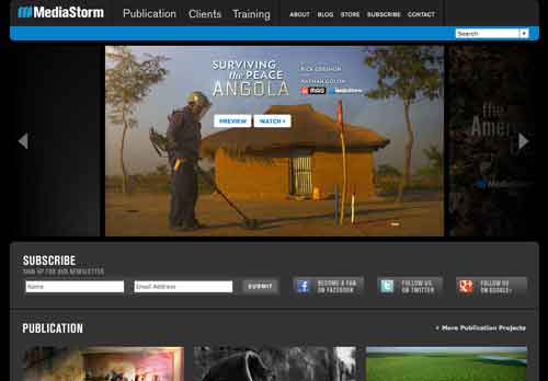
MediaStorm
MediaStorm, founded by Brian Storm, specializes in high quality visual narratives produced for the web or other digital devices.
Sources and Resources for MediaStorm
- The MediaStorm Approach to Storytelling – Brian Storm, Transom, 11/13/2012
Newsbound
Newsbound is a format for visual storytelling that combines photos, graphics, animations and text in a slideshow “stack.”
Interactive Video
These are video stories in which you can see or click on other multimedia elements that complement the main video story as it plays.
Here are some examples:
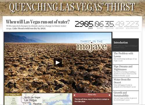
Quenching Las Vegas’ Thirst
Quenching Las Vegas’ Thirst is a video done in June 2008 by Zach Weiss for the Las Vegas Sun. As the video plays, the box below changes to display maps or graphics that expand on what is being shown in the video.
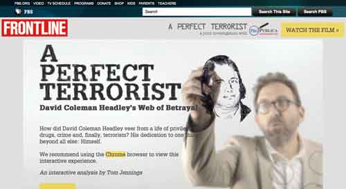
A Perfect Terrorist
A Perfect Terrorist is a video done for FRONTLINE/ProPublica in November 2011 in which the narrator “draws” items on the screen, and the user then can click on the drawings to get additional information.
The video pauses when an item is selected, and then can be resumed by the user when he/she is done reading the information in the item.
Punched Out
Punched Out is a story package published by the New York Times in December 2011 about a hockey player “enforcer” who suffered brain damage and drug addiction and died. The story is told with a series of three videos as the main narrative, and other multimedia elements, such as a slideshow, graphics or shorter videos, below the videos.
As the main video plays, different multimedia elements are highlighted. If you click on the highlighted element, the main video will pause so you can view the secondary multimedia and then resume play of the main video.
Alma
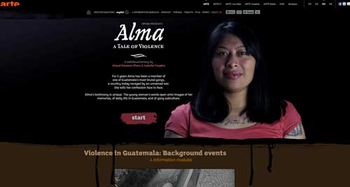
Alma, A Tale of Violence by Miquel Dewever-Plana and Isabelle Fougère is a documentary produced in 2012 that is based on an interview with a female member of a brutal Guatemalan gang. But as the interview plays, you can scroll up to see video clips, photos and animations showing gang life, street scenes, the violence and other images.
Deepwater Horizon
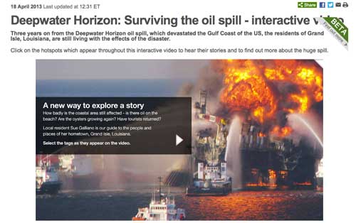
Deepwater Horizon: Surviving the oil spill is an interactive video produced by the BBC in 2013 that looks at the impact of the U.S. Gulf Coast oil spill three years later. As the video plays, pop-up boxes appear that you can select to see graphics or other videos that provide additional information on specific topics raised in the main video. As you explore the graphics or other videos, the main video pauses.
Prescribed
Prescribed: A Personalized Tour of ‘Obamacare’ produced by the Wall Street Journal in 2013 is an interactive video that explains the federal Affordable Care Act on health care from the perspectives of ordinary people affected by it (using a make-shift helmet cam to provide a first-person experience). As the video plays, you can click on interactive elements – charts of text or data, an audio clip, videos – that provide more details on issues raised in the video (which pauses when you select any of the interactive elements).
Sources and Resources for Prescribed:
- New approaches to online video at the Wall Street Journal – Journalism.co.uk, 7/24/2013
- How newsrooms are experimenting with interactive video online – IJNet, 7/30/2013
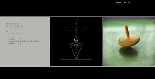
- a diagram of the object, such as a geometric shape, a waveform , an aerodynamic graphic
- a mathematical formula associated with the object
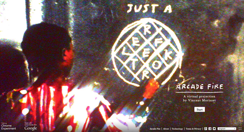
Just a Reflektor is an interactive music video of the song, Reflektor, by the band Arcade Fire. Released in September 2013 and produced by Vincent Morisset in collaboration with Google Creative Lab, the video plays on a website designed for display on a computer using the Google Chrome browser.
At the website you can connect your cellphone to your computer’s webcam and then use your cellphone to control special effects in the video as it plays on your computer.
Bob Dylan – “Like a Rolling Stone” Interactive Video
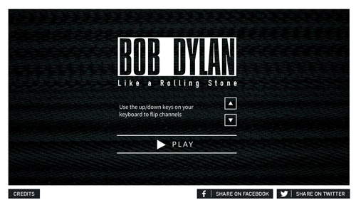
The Bob Dylan – “Like a Rolling Stone” Interactive Video is a music video of the classic Dylan song, but with 16 different “TV channels” of video that the viewer can select as the song plays. Each channel is an American television format in which the actors lip-synch the lyrics to the song. The video was produced by bobdylan.com in November 2013 using a technology platform created by digital media company Interlude.
Sources and Resources for Bob Dylan – “Like a Rolling Stone” Interactive Video:
- Bob Dylan’s ‘Like A Rolling Stone’ Released As Groundbreaking Interactive Video – bobdylan.com, 11/19/2013. The news release for the video.
Interactive Audio
An interactive audio story is one in which an audio clip or clips is the main story, and other multimedia elements enhance what you hear.
Interactive audio stories are rare and often use raw audio from some incident or event rather than a narrated or edited audio story (thus audio-photo slideshow stories are classified here as visual narratives, rather that interactive audio, because the audio and photos are integrated into a single experience and neither of the two media forms dominate the story)
Here are some examples:
The 9/11 Tapes
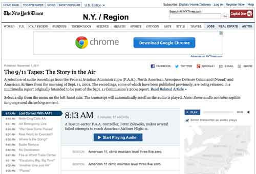
The 9/11 Tapes produced by the New York Times in September 2011 is a series of audio recordings of conversations between air traffic controllers and pilots of aircraft in the skies during the September 11, 2001, terrorist attacks.
As the audio clips play, an interactive map shows the flight paths of the hijacked planes being referenced in the audio tapes. A transcript of what’s being said also scrolls as the tapes play.
Boston EMS Radio Traffic
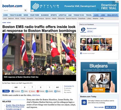
Boston EMS radio traffic published in August 2013 was put together by Boston Emergency Medical Services, which took 6 minutes of video footage of the Boston Marathon bombing scene shot by the Boston Globe’s Steve Silva and synchronized it with the audio of the emergency radio traffic at the time. The project was done to reassess what happened and for use in training sessions, but it also was posted on the Globe’s Boston.com website.
Animations & Illustrations
Some journalists are using various forms of animation and/or illustrations to tell stories online.
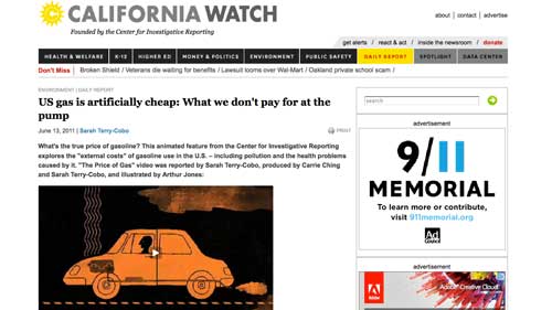
The Center for Investigative Reporting, has used a form of animation it calls “illustrated storytelling” to produce pieces on topics ranging from the price of gas to the environmental and other costs of eating hamburgers.
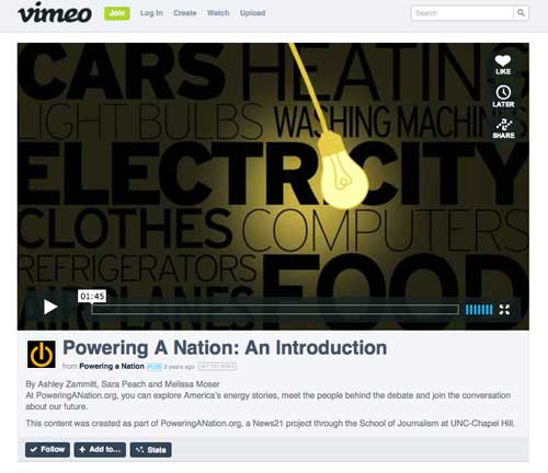
Another form of animation is known as kinetic typography – essentially text in motion. These stories are often created with the Adobe After Effects program, or sometimes the Flash animation program.
News organizations have experimented with kinetic typography because it is a more engaging or entertaining storytelling experience than a simple text presentation. It can be particularly effective as a way of highlighting important data or statistics.
Here are some examples of animated or illustrated stories:
The Price of Gas
The Price of Gas was produced in June 2011 by the Center for Investigative Reporting’s California Watch project to tell the story of the environmental and health impacts of using gasoline-powered vehicles.
The CIR has done other animations, including:
- In Jennifer’s Room
- The Hidden Costs of Hamburgers
- Suspect America
- Who Owns the Fish?
- The Man Who Killed Osama bin Laden
Powering a Nation was produced in 2009 by journalism students at the University of North Carolina as part of the News21 project in which journalism schools around the country experimented in new forms of online storytelling. The introductory video to the UNC project shown here is an example of the kinetic typography approach to telling a story using animated text and graphics.
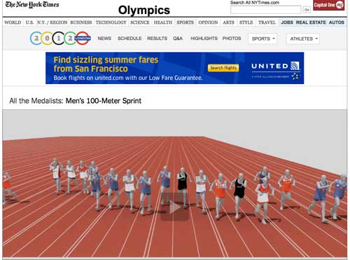
All the Medalists: Men’s 100-Meter Sprint
All the Medalists: Men’s 100-Meter Sprint is an animation the New York Times used to show how Olympic sprinters have become faster and faster over the decades.
Sources and resources on animations and illustrations:
- Kinetic typography as a storytelling technique – Lauren Rabaino, 10,000 Words, 10/14/2010
- Warning: This Article Contains Graphic Journalism – Truthout, 8/10/2011
- News organizations experiment with ‘illustrated storytelling’ — a new way to tell serious stories – Al Tompkins, Poynter, 3/20/2013
- How news can compete with cat videos: 6 lessons for multimedia journalists – Carrie Ching, Poynter, 4/5/2013
Collages
A collage is usually a fast paced story told primarily with photos and video clips that appear side-by-side on the screen. The collage is often used to tell a story in which movement or activity is an essential characteristic.
Here are some examples:
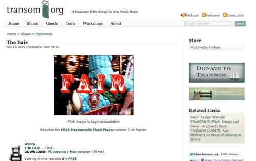
The Fair
The Fair by Jason Rayles is about a day at a county fair.
Produced in April 2004 in Flash, it is very fast paced with multiple images appearing simultaneously on the screen that mimic the activity and excitement of the fair. Rayles is a radio reporter who took photos at the fair and narrated the story.
Vox Pop
Some digital stories are collections of interviews with regular people talking about specific topics – a variant on the classic vox pop or man-on-the-street interview.
The interviews are usually short videos or photos with audio and often are presented in a tiled format in which several rows of still frames linking to the videos are stacked on a web page. The videos are usually raw – that is they don’t include narration or b-roll, but just the people speaking their minds as classic “voice of the people.”
Balloons of Bhutan
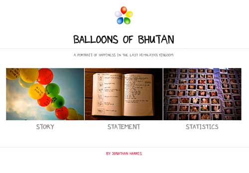
In Balloons of Bhutan produced in October 2011, Jonathan Harris interviewed people in the country of Bhutan about happiness, a trademark characteristic of their nation.
The interviews were presented as scores of photos, either small portrait shots or pictures of the hands of the people, that were tiled on a web page. Each picture linked to an audio recording of an interview with the person.
The balloons reference comes from Harris’ giving the people colored balloons that signified their levels of happiness and that then were strung across a mountain pass.
Games
Some news organizations have experimented with using online games to tell stories. Games are more engaging and are especially popular with young people. Games range in sophistication from relatively simple online quizzes to sophisticated immersive environments similar to classic video games.
Here are some examples:
Balance
The Gotham Gazette published the Balance budget game in 2009. It was an interactive quiz in which people could try to fix New York’s budget problems by making choices on spending and revenues.
Gimme Props
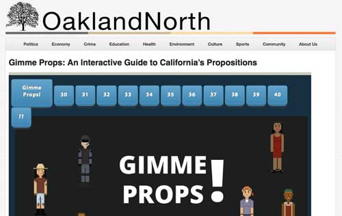
Gimme Props is an interactive quiz developed by students at the UC Berkeley Graduate School of Journalism to inform California voters about state ballot propositions in the November 2012 election.
Remembering 7th Street
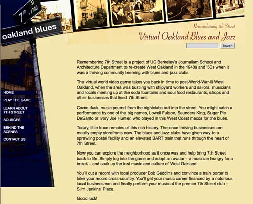
Remembering 7th Street was a project of UC Berkeley’s Graduate School of Journalism and Department of Architecture published in 2008 that re-created the Oakland blues and jazz club scene of the 1940s and 1950s as an online virtual world and video game.
Graphics for Storytelling
A graphic is the main element for telling the story in some digital news packages. The user clicks on sections or points on a graphic to get text information, photos or audio or video clips.
Here are some examples:
Loss of the Space Shuttle Columbia
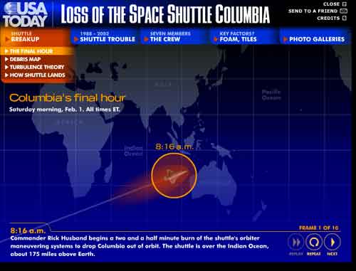
USA Today’s Loss of the Space Shuttle Columbia story package in February 2003 features a series of graphics that have links to information such as animations that show how the shuttle disintegrated and what caused the disaster. Other sections of the story package, which is done in Flash, include bios and photos of the crew members and photo galleries on different aspects of the story.
Climbing Kilimanjaro produced by the New York Times in October 2007 tells the story of author Tom Bissell’s exhausting climb to the peak with an animated graphic that is a fly-over of the Tanzanian mountain.
At points along the climb Bissell’s heat rate and oxygen levels are displayed along with videos or photos with audio in which Bissell describes the ordeal. Climbing Kilimanjaro thus is also an example of embedded multimedia. It also incorporates the mapping approach to storytelling.
Connected China is a very sophisticated series of graphics that display the intricate relationships in China’s power elite. It was produced by Reuters in February 2013 and used HTML5 to create animated graphics that in the past were mainly done using Flash.
You can click on the graphics to explore the relationships between members of the ruling communist party, the military and the government in modern China and read profiles of all the major leaders. A total of 30,000 relationships are documented in the database, which contains 1.5 million words. The package also includes links to text stories, videos and photos.
The project took 18 months to build and the underlying data about the Chinese leaders also is regularly updated so the graphic is kept current.
Sources and Resources on Connected China:
- Connecting the Dots – Reg Chua, (Re)Structuring Journalism, 3/4/2013. Chua is Editor, Data and Innovation at Thomson Reuters, and (Re)Structuring Journalism is his weblog.
- Current Connections – Reg Chua, (Re)Structuring Journalism, 3/27/2013. Chua is Editor, Data and Innovation at Thomson Reuters, and (Re)Structuring Journalism is his weblog.
- Reuters bets big on context, structure and dataviz to understand power in China – Nieman Journalism Lab, 4/24/2013
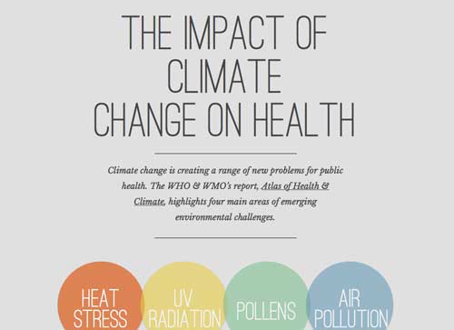
The Impact of Climate Change on Health is a scrollable interactive graphic about the effects world climate change is having on public health. As you scroll down through the graphic you can click on different elements to reveal additional information on a topic. Parts of the graphic use an animation approach to storytelling.The graphic was made by Nice and Serious, a creative studio that makes films, animations and websites.
Data Stories
Data is so central to some stories that the centerpiece for a news package presentation can be a data visualization, a chart or even a searchable database. A charticle, which uses a combination of graphics, text and photos in place of a traditional text narrative, can be a data story if data is a central part of the presentation.
Here are some examples:
A Week on Foursquare
A Week on Foursquare produced by the Wall Street Journal in May 2011 used a series of charts and data visualizations to show how people use the FourSquare mobile app in New York and San Francisco. The story explored a variety of data points, including how often FourSquare is used hour by hour, where people checked in using FourSquare, the frequency with which they checked in, differences in use of FourSquare because of gender, the most popular types of places for FourSquare check-ins, etc.
Dollars for Docs
Dollars for Docs is a nationwide searchable database of doctors created by ProPublica that tracks payments such as meal reimbursements, speaking and consulting fees, etc., that 15 pharmaceutical companies made to the doctors. Published in 2010, it was accompanied by several investigative text stories about different aspects of the relationship between doctors, the drugs they prescribe and the pharmaceutical companies, and additional related stories have been published since then.
The database also was updated in 2013, a project that took 6 months. Since it was first published, the database has had 5.74 million pageviews, according to ProPublica, and 170 news organizations around the country have published local stories based on the data.
Sources and Resources for Dollars for Docs:
- Heart of Nerd Darkness: Why Updating Dollars for Docs Was So Difficult – Jeremy Merrill, ProPublica, 3/25/2013
- ProPublica at five: How the nonprofit collaborates, builds apps, and measures impact – Justin Ellis, Nieman Journalism Lab, 6/10/2013
Timelines
Timelines are often just a single element in a multimedia story package, but they also can be the main component driving the narrative if history is a central aspect of the story.
Here are some examples:
Sea Monsters
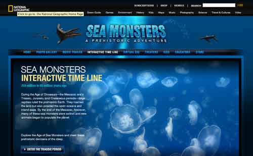
In its special package on Sea Monsters, National Georgraphic used an interactive timeline of geological periods to show how sea creatures evolved from prehistoric times.
Mapping a Story
These are stories that are location based and use a map as the central element around which the story is organized. You usually click on points on the map to navigate to different sections of the story.
This can provide a sense of going on a journey for stories with that have that kind of story line. Or it can provide a highly personalized experience for the user who can use the map to determine where and how he/she wants to peruse a story.
Here are some examples:
Architectural Monuments in a Reshaped Beijing
Architectural Monuments in a Reshaped Beijing was produced in April 2011 by the New York Times as part of its Olympic Games coverage.
Done in Flash, it used a series of maps to provide links to photos, photo essays, audio clips, and animations about different Olympic venues and city landmarks and development projects.
Van Gujjar Migration Project
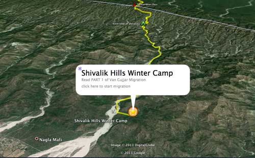
The Van Gujjar Migration Project uses a Google Earth map to provide an aerial view of a section of the Himalayan mountains and foothills in northern India that’s a migration route for nomadic water buffalo herders. You can click on points along the route to get a pop-up box with a text story and photos describing the herders journey. There also are a couple of videos you can play to watch to a herder singing a song or hear the sounds of the people and animals on their trek. The story is part of the non-profit Traditional Cultures Project to do documentary work on traditional cultures around the world.
Walking the Path of a Tornado
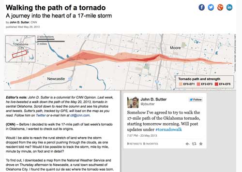
Walking the Path of a Tornado is a story by CNN reporter John Sutter who traced the 17-mile path of destruction left by a huge category 5 tornado in Oklahoma in May 2013. The story has three parts – a map of Sutter’s route at the top, a long, a scrollable text story below in which Sutter cataloged his journey, and screenshots of postings and photos Sutter uploaded to Twitter as he walked.
As the reader scrolls down through the text story, relevant tweets by Sutter appear on the right and dots appear on the map above showing Sutter’s location at each point, based on GPS readings of his Twitter postings along the route.
Riding the New Silk Road
Riding the New Silk Road is a New York Times story published on July 21, 2013, that re-traces the route of the ancient Silk Road between Europe and Asia. The route is displayed on a vertical map with points that link to accompanying photos and videos about those places. As you scroll down the locations pinpointed on the map change along with the photos/videos to which they’re linked.
About this Tutorial
Written by Paul Grabowicz, Jeremy Rue and Richard Koci Hernandez
Republishing Policy
This content may not be republished in print or digital form without express written permission from Berkeley Advanced Media Institute. Please see our Content Redistribution Policy.
© 2020 The Regents of the University of California

