Data visualizations make the complex more accessible. The illustration of data as charts, graphs, maps and graphics can give us new ways to look at information, and potentially gain more insight. By incorporating interactive elements into the visualizations, audiences can further experience what the data has to show.
Here are a few examples of interactive data visualizations, and tools you can use to achieve some.
A Dynamic Book

I am a book. I am a portal to the universe. This book is “an informative, interactive experience, in which the data can be touched, felt and understood, with every measurement represented on a 1:1 scale…. [it blends] playful design and data storytelling to introduce scientific concepts to a broad, all-ages readership.” What are your thoughts on the ways in which interactive data visualizations can be used to reimagine the presentation of data?
Mask Multiplication

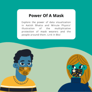
“An explorable essay on how masks can end COVID-19” illustrates the multiplicative protection of mask wearers and the people around them. Check out this interactive data visualization to showcase the power of a mask!
Interactive Tools

Constructive has a list of 6 Great Interactive Data Visualization Tools to get you started. Which data visualizations tools have been helpful for your daily use?
History in Action

TimelineJS is a tool from Knight Lab for creating interactive timelines. View tips and examples to inspire you through your data visualization journey.
Want to learn how to effectively use data for storytelling purposes? Sign up for our new Online Data Visualization course starting on November 16th.
Find these resources helpful? Sign up for our newsletter for updates on our courses and up-to-date resources. Follow our socials and let us know how we can assist you along your professional journey.
