As coronavirus case numbers continue to rise across the globe, we take a look at how COVID risk is being visualized. Calculate your potential risk, see how coronavirus is spread indoors, and the impact of wearing masks.
Choose Your Own Risk
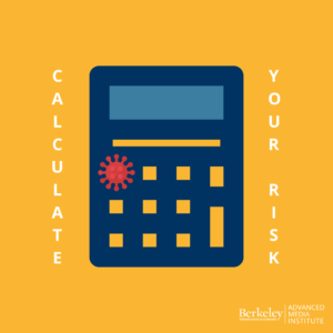
The microCOVID project is “a calculator that lets you estimate the risk of getting COVID from a wide range of activities, using the best research available. We hope this tool will help hone your intuition, lower your stress levels, and figure out good harm-reduction strategies.”
If you’re interested, read through their methodologies and learn how their model works.
Indoor Spaces
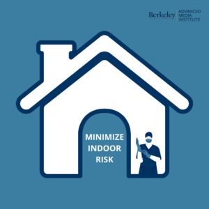
El Pais offers this interactive scroller visualization on minimizing risk indoors. A room, a bar and a classroom: How coronavirus is spread through the air.
Masks On

The New York Times visualizes how masks block COVID at the particle level, in another scrolling interactive set of illustrations and visualizations.
This data visualization from July via NPR shows how mask wearing can reduce the virus spread by 30%, and the lasting impact that has over time.
Want to learn how to effectively use data for storytelling purposes? Sign up for our new Online Data Visualization course starting on January 25th.
Find these resources helpful? Sign up for our newsletter for updates on our courses and up-to-date resources. Follow our socials and let us know how we can assist you along your professional journey.
![]()
![]()