As the race to finish a coronavirus vaccine draws near, people are asking the question: Who gets it first? Choosing priority is nothing new to healthcare systems – triage and patient management are important skills to hospitals and systems at large. What factors into those decisions?
Data visualization in healthcare works as it does at large: providing insight into patterns and correlations, making data analysis more efficient and highlighting takeaways. Here are a few examples from around the web that explore healthcare data through visualization.
Your Place In Line
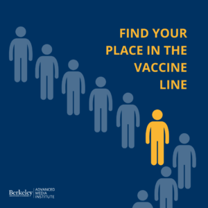
The New York Times, working with Surgo Foundation and Ariadne Labs, offers this interactive visualization tool Find Your Place in the Vaccine Line.
New York Times also defines “essential” and “frontline” workers in this visualization from Matthew Conlen.
Medical Data Viz
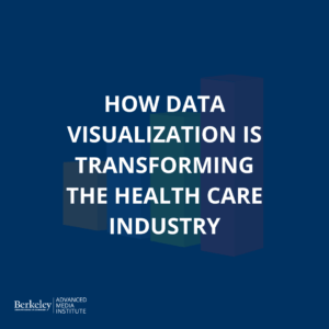
Modus presents How Data Visualization is Transforming the Health Care Industry with examples like infographics, motion graphics, interactive widgets and dashboards. They argue that data viz not only helps medical professionals analyze data, but provides transparency as well.
Research Findings
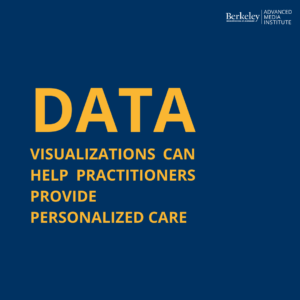 This user-centered design study concludes that visualizations can help practitioner’s provide personalized care: Data Visualizations to Support Health Practitioners’ Provision of Personalized Care for Patients With Cancer and Multiple Chronic Conditions: User-Centered Design Study
This paper published in the Journal of Biomedical Informatics supports that better visualization of system and individual status can aid in better decision-making: Dashboard visualizations: Supporting real-time throughput decision-making
Want to learn how to effectively use data for storytelling purposes? Sign up for our new Online Data Visualization course starting on January 25th.
Find these resources helpful? Sign up for our newsletter for updates on our courses and up-to-date resources. Follow our socials and let us know how we can assist you along your professional journey.
![]()
![]()