The holidays are a time when family comes together, and people reflect on the relationships and the histories that make up their life and lineage. We take a look at how families are visualized through relational names, family trees and migration maps.
Family Name Calling
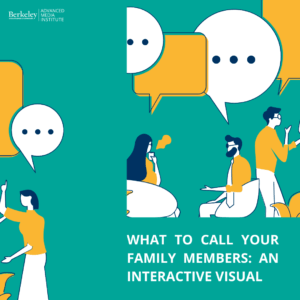
Here is an interactive visual for those oft-perplexing family names. Figure out what to call your family members in Flowing Data’s What To Call Your Distant Relative.
Or check out their Chart of Cousins for more.
As a Tree Grows
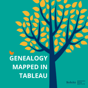
If you are getting into visualizing genealogy, check out 12 Generations Mapped In Tableau, or this example Navigating Your Family History in Tableau, or this yWorks guide on Drawing Family Trees With JavaScript.
Mapping Migration
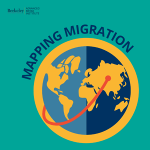
Part of understanding your family history is looking at genealogical diaspora and migration data. California Academy of Sciences created this Human Odyssey interactive map visualizing human migration from the origin of modern humans.
Also check out: National Geographic’s The World’s Congested Human Migration Routes in 5 Maps, and the Migration Policy Institute’s Net Number of Migrants by Country, 1950-2015 (by Five-Year Intervals).
Want to learn how to effectively use data for storytelling purposes? Sign up for our new Online Data Visualization course starting on January 25th.
Find these resources helpful? Sign up for our newsletter for updates on our courses and up-to-date resources. Follow our socials and let us know how we can assist you along your professional journey.
![]()
![]()