How do we tell complex stories? Let’s explore this question by looking through data visualizations created for the 2020 presidential election. Before getting to these examples, let’s understand what we mean by data visualization. Data visualization can be a compelling way to communicate the complexities of information through graphs, charts, maps, and other visuals.
Now, here are a few visualizations that give a sense of who is voting, how candidates are positioning themselves, and how U.S. citizens can exercise their right to cast a ballot.
Census-Based Voter Data
The U.S. Census Bureau has several visualizations on registration and voting habits. Additionally, they include congressional voting rates by district and participation based on stated gender. See how effective data visualization can aid in the presentation of such information.
Election Forecasts
FiveThirtyEight’s hub for election forecasting, runs different scenarios to show potential outcomes for the 2020 presidential election, exploring margins and tipping points, change over time, and “weird” possibilities (extra credit for taking a peek at their methodology). Before you proceed, how effective was their integration of data visualization to make aid their predictions?
Comparative Ad Spending

The Marshall Project compares Trump’s vs. Biden’s criminal justice ad spending on Facebook on a timeline that highlights events like the President’s deployment of federal forces to Portland, Seattle and Washington DC.
How to Vote by State
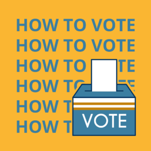
FiveThirtyEight provides an interactive data graphic on How to Vote in the 2020 Election, broken down by state. Find information on options like early voting and vote-by-mail by state.
Want to learn how to effectively use data for storytelling purposes? Sign up for our new Online Data Visualization course starting on November 16th.
Find these resources helpful? Sign up for our newsletter for updates on our courses and up-to-date resources. Follow our socials and let us know how we can assist you along your professional journey.