Blog
Interactive Data Visualizations
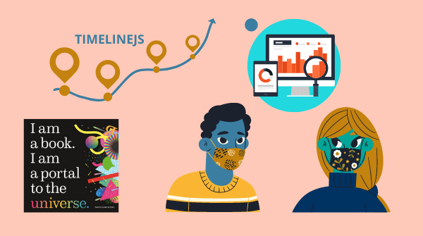
Data visualizations make the complex more accessible. The illustration of data as charts, graphs, maps and graphics can give us new ways to look at information, and potentially gain more insight. By incorporating interactive elements into the visualizations, audiences can further experience what the data has to show. Here are a few examples of…
Read MoreFree Data Visualization Tools
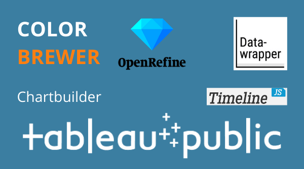
Learning to work with data might be complex, but it doesn’t have to be costly. While there are paid tools and services that offer full functionality and might meet the needs of power users or businesses, there are many robust free and open source solutions out there to try. Here are a handful…
Read MoreVoting in Visuals

How do we tell complex stories? Let’s explore this question by looking through data visualizations created for the 2020 presidential election. Before getting to these examples, let’s understand what we mean by data visualization. Data visualization can be a compelling way to communicate the complexities of information through graphs, charts, maps, and other visuals.…
Read MoreEmployer Funded Training

If you’re employed and want to take a course or workshop to boost your skillset, you should be aware that your employer might pay for it. Here are some resources to help you write off your education expenses through employer funded training. Justifying Your Training Your employer may or may not have…
Read MoreVisualization of Fires in the West

Wildfires have raged across California and the Pacific Northwest, burning millions of acres. Let’s take a look at ways to visualize the impact of these fires. 100 Years of Burning Watch how data visualization was used to portray the change of the severity and frequency of fires in this animated map…
Read MoreAdaption

What does it take to gain an education online? As distance learning becomes the norm, it becomes more necessary to adapt, evolve and maximize the experience of learning remotely. Reinventing Education Fast Company’s series on the current state of schools and learning, Reinventing Education, explores “the ongoing efforts to keep children safe in…
Read MoreExpanded Education
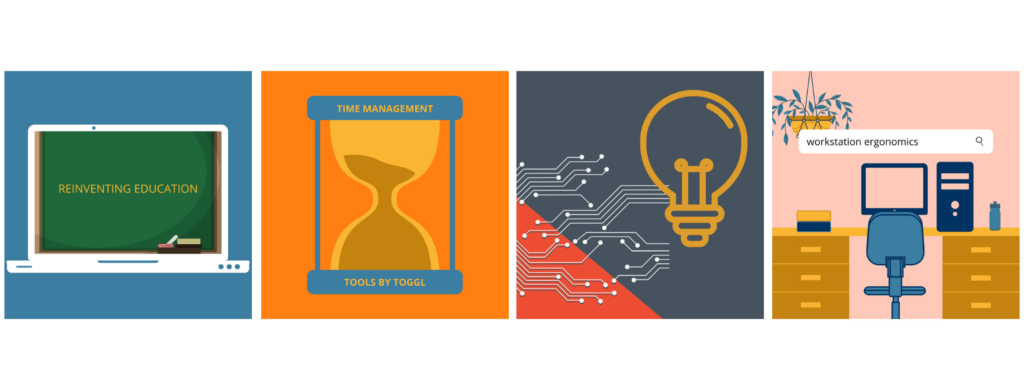
Now more than ever, we are living in virtual spaces. Many people work remotely, socialize over devices and go to school online. The latter has many pitfalls and struggles, but it opens up the possibility to learn things never before accessible. Here are some courses, lectures, and resources for expanding your knowledge base. …
Read MoreDesign Thinking For Innovation
Design thinking is a powerful tool, available to anyone, for creative problem solving and innovation.
Read MoreSpring 2019 Workshops Announced!
This spring, Berkeley Advanced Media Institute is producing eight exceptional workshops in multi-media storytelling. Designed for the career professional, Berkeley Advanced Media Institute specializes in multi-media instruction including; documentary filmmaking, podcast story development, advanced video editing, visual story creation using your iPhone and data visualization. Every workshop is developed to inspire creativity and increase…
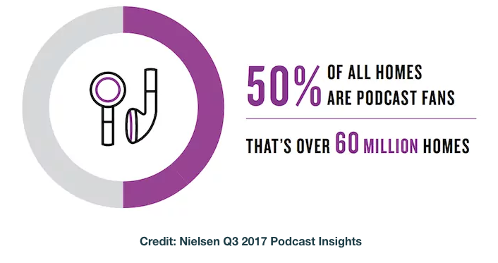
Read MorePodcast Listeners are Loyal, Affluent & Educated
Podcast Listeners are Loyal, Affluent & Educated From: podcastinginsights.com For more insights visit: Nielsen Q1 2018 Podcast Insights (pdf) & Edison Research Infinite Dial 2018 (pdf) [arrow_forms id=’2559′]
Read More