Latest Blog Posts

Ready To Choose Your Podcast Format?
If you're considering creating a podcast, the first step is to think about the format that will best tell your story. While there are many podcast formats, choosing the right one is crucial for engaging your audience and keeping them coming back for more.
Read More 
Data Visualization in Healthcare
As the race to finish a coronavirus vaccine draws near, people are asking the question: Who gets it first? Choosing priority is nothing new to healthcare systems – triage and patient management are important skills to hospitals and systems at large. What factors into those decisions? Data visualization in healthcare works as it does…
Read More 
Ideas For Podcasting
If you want to start a podcast, but not quite sure where to start, or if you are interested in adding new segments that change up the feel of your current podcast, check out these articles below. There are also ideas to help you promote your new podcast. A New Idea This…
Read More 
Family Dynamics Visualized
The holidays are a time when family comes together, and people reflect on the relationships and the histories that make up their life and lineage. We take a look at how families are visualized through relational names, family trees and migration maps. Family Name Calling Here is an interactive visual for those oft-perplexing…
Read More 
Digital Media Gift Guide
If you’re looking for a gift to give your storyteller friends and family this season, or you are looking to treat yourself, take a peek at these picks recommended across the web. Audio Headphones Discover Pods has a comprehensive list for 30 of the Best Podcast Headphones, including factors to consider when choosing…
Read More 
Visualizing Risk
As coronavirus case numbers continue to rise across the globe, we take a look at how COVID risk is being visualized. Calculate your potential risk, see how coronavirus is spread indoors, and the impact of wearing masks. Choose Your Own Risk The microCOVID project is “a calculator that lets you estimate the risk of getting…
Read More 
Sound Design for Storytellers
Sound design is a crucial part of audio and video storytelling, giving depth and life to podcasts, film, audio books and more. Listen to real examples of podcasts that use sound effectively, find resources for your own productions, and learn the principles of sound design yourself. Design-Heavy Podcasts This list of 10…
Read More 
Mapping Elections
Maps are a key tool for visualizing data, but they have their limits. Consider these articles on why it can be problematic, a potential alternative, and a contest to enter if you’re up to the challenge this week. Misleading Maps This New York Times Opinion piece: Election Maps Are Everywhere. Don’t Let Them…
Read More 
Multimedia Halloween
Here are assets for your multimedia productions on everything Halloween-related, and some podcasts to lend your ear to this season. Halloween By The Numbers This comprehensive Halloween infographic from The Shelf tells you how much is spent on Halloween, the popularity of haunted houses by the age, and the top costumes by…
Read More 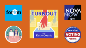
Podcasts on Voting
Citizens exercising the right to vote is a key part of democracy. As we head into the U.S. Presidential election, many are focused on getting more people to vote. One of the ways to encourage voting is through podcasting. Here are a few podcasts that are focusing on getting people to vote through exploring…
Read More 
Interactive Data Visualizations
Data visualizations make the complex more accessible. The illustration of data as charts, graphs, maps and graphics can give us new ways to look at information, and potentially gain more insight. By incorporating interactive elements into the visualizations, audiences can further experience what the data has to show. Here are a few examples of…
Read More 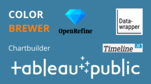
Free Data Visualization Tools
Learning to work with data might be complex, but it doesn’t have to be costly. While there are paid tools and services that offer full functionality and might meet the needs of power users or businesses, there are many robust free and open source solutions out there to try. Here are a handful…
Read More 
Voting in Visuals
How do we tell complex stories? Let’s explore this question by looking through data visualizations created for the 2020 presidential election. Before getting to these examples, let’s understand what we mean by data visualization. Data visualization can be a compelling way to communicate the complexities of information through graphs, charts, maps, and other visuals.…
Read More 
Employer Funded Training
If you’re employed and want to take a course or workshop to boost your skillset, you should be aware that your employer might pay for it. Here are some resources to help you write off your education expenses through employer funded training. Justifying Your Training Your employer may or may not have…
Read More 
Visualization of Fires in the West
Wildfires have raged across California and the Pacific Northwest, burning millions of acres. Let’s take a look at ways to visualize the impact of these fires. 100 Years of Burning Watch how data visualization was used to portray the change of the severity and frequency of fires in this animated map…
Read More 
Adaption
What does it take to gain an education online? As distance learning becomes the norm, it becomes more necessary to adapt, evolve and maximize the experience of learning remotely. Reinventing Education Fast Company’s series on the current state of schools and learning, Reinventing Education, explores “the ongoing efforts to keep children safe in…
Read More 
Expanded Education
Now more than ever, we are living in virtual spaces. Many people work remotely, socialize over devices and go to school online. The latter has many pitfalls and struggles, but it opens up the possibility to learn things never before accessible. Here are some courses, lectures, and resources for expanding your knowledge base. …
Read More 
Design Thinking For Innovation
Design thinking is a powerful tool, available to anyone, for creative problem solving and innovation.
Read More 
Spring 2019 Workshops Announced!
This spring, Berkeley Advanced Media Institute is producing eight exceptional workshops in multi-media storytelling. Designed for the career professional, Berkeley Advanced Media Institute specializes in multi-media instruction including; documentary filmmaking, podcast story development, advanced video editing, visual story creation using your iPhone and data visualization. Every workshop is developed to inspire creativity and increase…
Read More 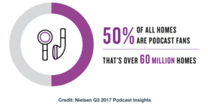
Podcast Listeners are Loyal, Affluent & Educated
Podcast Listeners are Loyal, Affluent & Educated From: podcastinginsights.com For more insights visit: Nielsen Q1 2018 Podcast Insights (pdf) & Edison Research Infinite Dial 2018 (pdf) [arrow_forms id=’2559′]
Read More 
7 Podcast Series to Get You Started
7 PODCAST SERIES TO GET YOU STARTED New to podcasts and want to get started with something interesting and captivating? Here is the list of 7 podcast series we’re listening to right now. The Why Factor • Genre: Science, Psychology, Explained • Content: Each week, listeners are presented with an idea and topic of human-centered interest and…
Read More 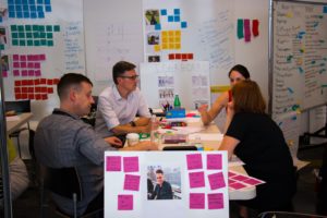
A LOT MORE EXPERIMENTS: OPEN MATTER PARTNERS WITH BERKELEY ADVANCED MEDIA INSTITUTE
Apply Now for Local News Bootcamps When the old model is broken, what will work in its place? The answer is nothing will work, but everything might. Now is the time for lots and lots of experiments.— Clay Shirky Matter was founded in 2012 as a place for experiments in media to happen, from both…
Read More 
Sharing Audio on Social Media: Anchor vs. Audiogram Generator
Sharing Audio on Social Media: Anchor vs. Audiogram A question that still puzzles many podcasters and audio storytellers is: how do I distribute audio on social media? With platforms such as Facebook, Instagram, and Twitter that thrive on visual posts, audio can easily be buried in your audience’s feeds. Many audio producers have resorted to…
Read More 
Podcast proliferation drives greater need for audio skills
Podcast proliferation drives greater need for audio skills Nearly a quarter of Americans are listening to at least one podcast a month—that’s more than use Twitter. That’s one of the findings from Edison Research’s 2017 Infinite Dial report, which charts digital media consumption in the U.S. The study shows podcast listenership is continuing its steady…
Read More 
Shaping the Future
Rise Up Be Heard Fellowship The UC Berkeley Advanced Media Institute played host earlier this month to an enthusiastic class of reporters-in-training: eleven young members of online and cable news outlet Fusion’s Rise Up Be Heard fellowship program, who came to Berkeley to hone their video skills. Now in its second year, the Rise Up…
Read More 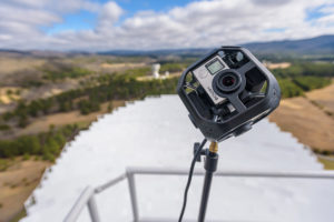
Take yourself on a 360° tour of the largest fully-steerable telescope in the world.
[vc_row][vc_column][vc_column_text] Shooting a 360° video requires you to abandon all that you ever knew about shooting video. No close-ups. No angles. No focal lengths. Chris Schodt, multimedia expert & video producer, explores the nuances of 360° video during a recent shoot in a remote region of West Virginia. This past March, he ventured out…
Read More 
Experimenting With Bots
Experimenting With Bots Tawanda Kanhema has a thing for apps. Facebook Messenger apps, to be specific. In November, Kanhema, was a part of the AJ+ team who developed a messaging bot for Election Day 2016. “We were looking for ideas on how to cover the election differently beyond just creating video and media posts,” said…
Read More 
Podcast Production Services
Podcast Production Services Podcasting is the new “gold” in digital media. As a medium it’s easily consumable- we are able to multitask while listening, and podcasts are available on a multitude of mobile devices. With the increase for this on-demand audio there is a need for more-high quality professional podcasts to be produced. As with any…
Read More We tried audio transcription software Trint. Here’s what we found.
We tried audio transcription software Trint. Here’s what we found. Transcription of audio & video recordings can be a mundane, time-consuming process that is important but often performed begrudgingly. We tested out cloud-based software Trint, which automatically transcribes audio from podcasts or audio recordings and audio from video, saving users hours of work. Why is…
Read More 
5 Reasons to Start Using iPhone Video
5 Reasons to Start Using iPhone Video by Diane Villadsen 1) It’s compact. You can still produce and edit high-quality videos on the go, without having to bring lots of heavy gear with you. With just a pocket-sized device and a few accessories, you have a powerful video production suite that can travel with you.…
Read More 
What You Should Keep When Selling Your Film
What You Should Keep When Selling Your Documentary Film By Anna Darrah & Jilann Spitzmiller With film distribution evolving as quickly as technology is adapting to meet consumers’ needs, it’s a tough time to keep up with the best way to get your film out to the world. The great thing is that any and…
Read More 
What to Expect at our Podcasting Workshop
What to Expect at our Podcasting Workshop Many people consider the process of audio production to be daunting: monitoring levels and splicing together a recording in Adobe Audition is a foreign experience to most. Ben Manilla, long-time radio personality and podcasting instructor, understands those challenges and quickly puts students’ minds at ease. That’s one reason…
Read More 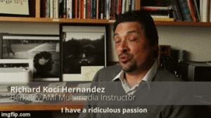
Watch Now: The 6-Year Photo Quest
An Interview with Richard Koci Hernandez Watch Richard Koci Hernandez, Berkeley Advanced Media Institute instructor and multimedia expert, tell the story of the photo that took him six years to capture. The photo, which was taken right outside the UC Berkeley Graduate School of Journalism, is the result of Koci waiting six years for the…
Read More 
Engage your Audience with New Media
Engage your Audience with New Media Imagine a college student attempting to watch a silent film today. Their mind would struggle to focus on something without sound, color, gifs, scrolling! Even sitting a 20-something down in front of a website from 10 years ago wouldn’t hold their interest for long. The tastes of today’s audiences are…
Read More 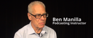
Ben Manilla on the Power of Podcasting
Ben Manilla on the Power of Podcasting An expert in creative sound production, Ben Manilla teaches the Podcasting: Telling Stories in Sound workshop at the Berkeley Advanced Media Institute. In this video interview, he shares his insight into what makes audio storytelling so powerful. According to a recent study released by Edison Research, 1 in…
Read More 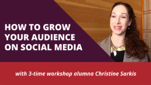
Video Interview with 3-Time Workshop Alumna Christine Sarkis on Social Media Growth
Video Interview with 3-Time Workshop Alumna Christine Sarkis on Social Media Growth Christine Sarkis, Senior Editor at Smarter Travel, has attended three Berkeley AMI workshops: Social Media for Content Creators, Mobile Media: Producing Visual Stories on the iPhone, and Podcasting: Telling Stories in Sound. She has produced multiple videos for Smarter Travel – all on…
Read More 
Berkeley Advanced Media Institute & Berkeley Tableau User Group Present: Lutz Finger
Berkeley Advanced Media Institute & Berkeley Tableau User Group Present: Lutz Finger Reserve your seat Berkeley Advanced Media Institute has partnered with Berkeley Tableau User Group to bring Lutz Finger, renowned data scientist, to Berkeley. He will be presenting a keynote on the future of data and the media industry. All are welcome to attend the…
Read More 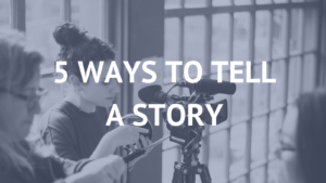
5 Ways to Tell a Story in 2016
5 Ways to Tell a Story in 2016 It’s been a while since we relied on gathering around the fire to hear a story. People now turn to many forms of digital media to get the information they want to know. Here are 4 important storytelling tools to make use of in 2016: 1. VIDEO…
Read More 
Stories in Sound with Ben Manilla
Stories in Sound with Ben Manilla December 9, 2015 As podcasting workshop alumna Nadine Sebai describes in the segment above, producing a successful podcast requires a few key ingredients, including a compelling story, narration and natural sounds, but award-winning radio journalist Ben Manilla knows the extra magic needed to bring an audio story to life.…
Read More How to Build a Loyal Audience
It’s not magic or witchcraft. With these simple to implement tips, Neil Patel illustrates how to build a loyal audience in an online environment. Courtesy of: Quick Sprout
Read More 

Arts & Culture Storytelling on the Web: Tenacity and Tools Required
February 26, 2014 By Gary Moskowitz A few months ago, Bloomberg laid off its theater critic and dismantled its culture desk to focus simply on “luxury.” USC’s Annenberg School is shutting down its Getty Arts Journalism fellowship program. Harvard’s Nieman Fellowship in Arts & Culture Reporting no longer exists. In recent years, the Village…
Read More 
June 2013 Multimedia Institute: What you’ll take away
Multimedia Storytellers Join The Institute Every June we host a two-week Multimedia Storytelling Institute designed to equip journalists, educators and other communications professionals with the skills they need to produce and distribute their own multimedia projects. For those hoping to learn new storytelling tools, the prospect of dedicating two weeks to a workshop can be both thrilling and…
Read More 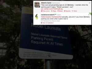
Alberto Cairo Presentation at the May 4th ” Data Journalism Symposium”
Visual communications expert Alberto Cairo shares his slideshow presentation on the art of infographics. Presentation at Berkeley, May 4th, 2013 by Alberto Cairo
Read More 
Q&A with Alberto Cairo: Exploring the art and ethics of infographics
April 18, 2013 By Mitzi Mock We’re only two weeks away from our data journalism symposium. Have you registered, yet? In the meantime, we’ve been checking in with our symposium speakers, who are giving us a preview of their presentations and offering their musings on the field of data visualization. Earlier this week we spoke to Code…
Read More